Earlier today I criticized Ross Douthat’s column acknowledging that he was wrong about deficits. That’s fine, some might say, but what about you, big talker? Any big mistakes you’d like to own up to this year?
Sure. The problem here isn’t ego, it’s laziness. I don’t have even the haziest recollection of what I’ve written this year, and there’s no easy way to scroll through all my posts and scan them for my biggest bloopers. I suppose I could crowdsource this, but it’s a little late for that. However, I can get a list of my 20 most popular posts and then look through them to see how they hold up. How about that? First, here they are in chart form:¹
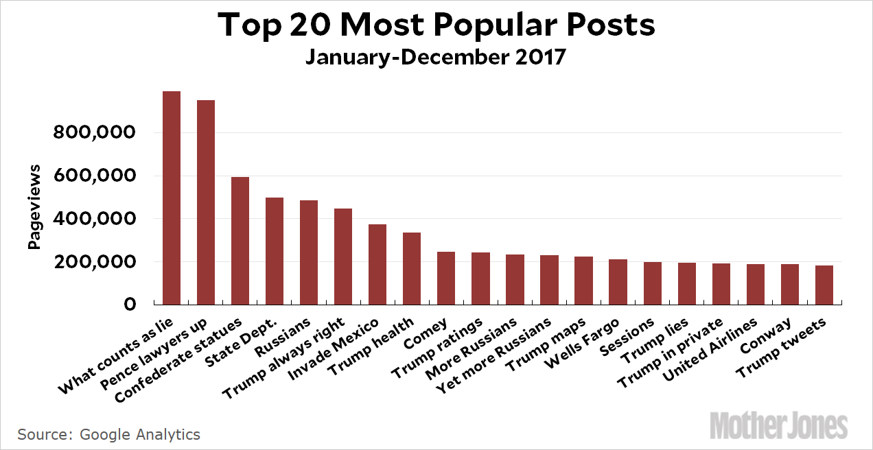
I got almost a million pageviews for my most popular post, but it topped out tantalizingly short at 990,000. Oh well. Here they are, one by one:
- What Does It Take to Finally Call a Lie a Lie? We Have an Answer. On January 23, the New York Times wrote a story about Donald Trump’s claim that he won the popular vote and actually labeled it a lie in the headline. I offered up a test for judging the deceptiveness of a statement, and I stand by it as useful. As for whether the media is finally willing to label Trump’s lies as lies, I’d say (a) they mostly are, and (b) we’ve gone so far beyond this that it kind of doesn’t matter anymore.
- Vice President Pence Lawyers Up. Yes he did. “This is not normal,” I said, and indeed it isn’t.
- The Real Story Behind All Those Confederate Statues. They were erected long after the Civil War, mostly as monuments to Jim Crow and white supremacy, not really as memorials to the war dead. I think I revised some of the details of this as I wrote about it further, but I basically got it right.
- Management Team at State Department Resigns En Masse. Yes they did, and it’s only gotten worse since it happened.
- NYT: Trump Team Had “Repeated Contacts” With Russian Intelligence During the Presidential Campaign. No regrets about this one.
- Donald Trump Is Always Right. This is about one of those stream-of-consciousness Trump interview, the theme of which is Trump has been right about everything. He still seems to believe this.
- Donald Trump Hangs Up On Australia, Threatens to Invade Mexico. I guess there’s some (legitimate) question about whether Trump really “hung up” on Malcolm Turnbull, but it was definitely a testy exchange.
- Donald Trump Lied To Us About His Health. Yes he did. And I’ll bet he’s getting ready to do it again.
- Say It With Me Again: James Comey Elected Donald Trump President. No regrets about this one. It’s still true and will always be true.
- Donald Trump Is Unhappy That His Ratings Aren’t Better. Trump watches a lot of TV and cares a lot about his ratings. Possibly even more true now than it was in February.
- CNN: Trump Team Gave Russians “Thumbs Up” to Release Hillary Smears. I guess this is still under investigation, but it sure looks like Team Trump was involved with Russia in some way.
- How Did Trump Win? The FBI and the Russians. Yeah. But mostly the FBI.
- President Trump Likes Graphics and Maps. Look, I like graphics and maps too. The problem is that Trump seems to like only graphics and maps, not any of the associated words that would help him understand the world at more than a sixth-grade level. As the year has progressed, it’s become more and more obvious that this is true and Trump almost literally knows nothing about anything these days.
- Wells Fargo Accidentally Admits the Truth: The Republican Tax Bill Has No Connection to its $15 Minimum Wage. No regrets here. Wells Fargo pretty clearly planned all along to raise its minimum wage this year, but tried to suck up to Trump by pretending it was because of his tax bill.
- It’s Raining Shoes in the Jeff Sessions Affair Today. This was just a general roundup of news from the day Jeff Sessions recused himself from the Trump-Russia investigation. Trump is still mad about that.
- Trump “Considering” Intriguing New Way to Lie With Statistics. This was about a Trumpian proposal to change the way trade deficits are calculated so it would make the trade deficit look worse and, I dunno, give him an excuse to kill NAFTA or something. In the end, this never happened. Trump appears to have decided that the best approach is to simply claim that things have gotten better (or worse) without bothering to provide any kind of evidence.
- In Private, It Turns Out That Trump Is Pretty Much the Same. This one was about Trump’s meeting with German officials, in which he demonstrated appalling ignorance of just about everything. As near as I can tell, Angela Merkel’s response to this has been to simply try to ignore Trump as much as possible and hope that America comes to its senses sometime soon.
-
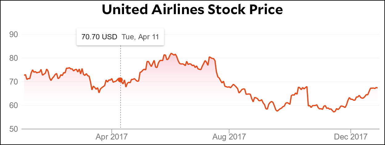
United Airlines Lost a Billion Dollars This Morning. This was about United’s stock market plummet the day after they dragged a passenger off one of their planes. They lost a billion dollars in market cap that day, but: “On the bright side for UAL, this will probably last only a day or so….Tomorrow some other airline will do something outrageous and we’ll all vow never to fly them ever again.” It looks like I was right about that:
- Kellyanne Conway Is a Lying Hack. Anybody have a problem with this?
- Donald Trump Edits a Tweet. This was an exegesis of a tweet that Trump deleted and then reposted with a few edits. It was speculative, and I guess I’m still not sure why he did it.
Now, some of you are going to say I cheated because the posts where I got something wrong aren’t likely to be among my most popular. That’s possible. So let’s crowdsource this after all. Go ahead and nominate my worst howlers of the year. Depending on what I have going on tomorrow, maybe I’ll take on a few of them.
¹Because, come on, what kind of Kevin Drum roundup post would it be without a chart?