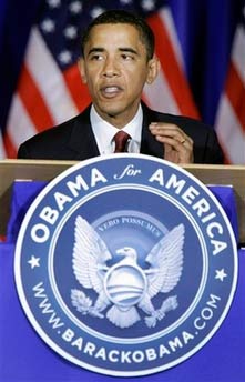
 I’ve written before about the artwork inspired by Barack Obama’s run for the presidency, as well as his own campaign’s choice of fonts, and it’s all good, but their latest design choices are apparently causing some controversy. While the campaign’s eschewing of the candidate’s name on podium placards raised eyebrows, their current podium design has even the Drudge Report giving it an alarmist link: “Obama Changes Presidential Seal,” he claims. It turns out the campaign debuted a new design (right) that appears to be “inspired” by the actual presidential seal, but with some important differences, as the Associated Press reports:
Instead of the Latin ‘E pluribus unum’ (Out of many, one), Obama’s says ‘Vero possumus’, rough Latin for ‘Yes, we can.’ Instead of ‘Seal of the President of the United States’, Obama’s Web site address is listed. And instead of a shield, Obama’s eagle wears his ‘O’ campaign logo with a rising sun representing hope ahead.
After the jump: the dreaded “P” word, and I don’t mean “public financing.”
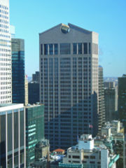 Drudge types may look at this as a troubling revision of one of our country’s great symbols, but from a design perspective, it’s quite lovely: the blues change subtly with each concentric circle, and the eagle and campaign logo look positively 3-dimensional, like some sort of elaborate papercraft sculpture. The New York Times famously called Obama a Mac and Clinton a PC in a comparison of the two campaigns’ web sites, but honestly, Obama’s designs are one step beyond Mac’s neo-Nordic minimalism. With the sleek sophistication of their Gotham font (originally designed for GQ magazine) offset with an almost winking use of classical filigrees and a delicate script, it’s both traditional and distinctly new. I hate to use the word “postmodern,” but boy, doesn’t this style seem like it would fit right in at the Philip Johnson-designed AT&T Building (now the Sony Building) in New York (left), which combines function and ornament in a way that foregrounds the quotations? If you want to over-analyze a bit (and why not, it’s a blog!), there are a couple things from postmodernism’s Wikipedia page that bear quoting:
Postmodernity is a state of being … concerned with changes to institutions and conditions. …[While] modernity [is a] cultural condition characterized by constant change in the pursuit of progress, postmodernity represents the culmination of this process, where constant change has become a status quo and the notion of progress, obsolete.
You can critique the design the same way a lot of people critique Obama’s candidacy: it sure looks pretty, but will people really vote for it? Plus, now that I think about it, it is kind of ’90s. Too bad the campaign didn’t take up the most current design trend: flashing, so-bad-it’s good, M.I.A.-style neo-’80s fluorescent ridiculousness. Now that would really say “change.”