Here’s a chart showing how much health insurance cost in 2000 vs. 2010:
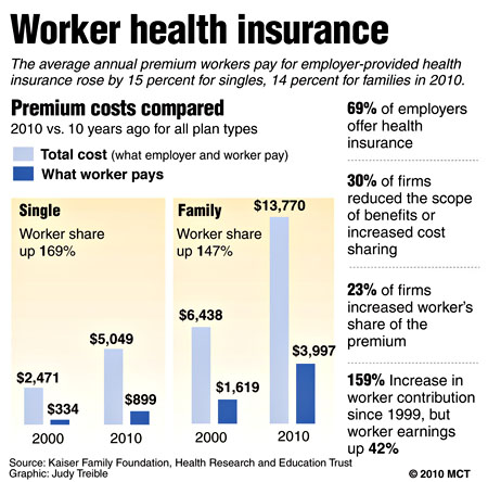
To summarize: for singles, the employer share of health insurance has gone up from about $2,000 to about $4,000. That’s a $2,000 increase. For family policies, the employer share has gone up from about $5,000 to $10,000. That’s a $5,000 increase.
If you figure that policies are split about 60-40 in favor of family policies, that’s an average increase per worker of around $4,000. Adjusted for inflation, that’s about $3,000 in extra benefits that we’re getting in our pay packets.
Data for cash income is only available through 2008, but it’s certainly gone down since then, which means that average real cash earnings during the past decade have probably gone down from $39,000 to about $37,000 or so. Add back in the value of the healthcare premiums we get, and average income has gone up from $39,000 to $40,000. This is all back-of-the-envelope stuff, but it’s close enough to get a pretty good idea of how much average income has gone up over the past decade. Answer: a whopping 0.2% per year.
I won’t bore you with a comparison to the increase for the super rich. You’d just get depressed.
UPDATE: Aaron Carroll says things are even worse than I suggest here. If you look at trends in benefit levels, copays, deductibles, and premium costs, the non-healthcare portion of worker income may have actually declined over the past decade. Are we all getting better healthcare for all this extra money? Maybe. But it’s no surprise that families are feeling squeezed by this.


