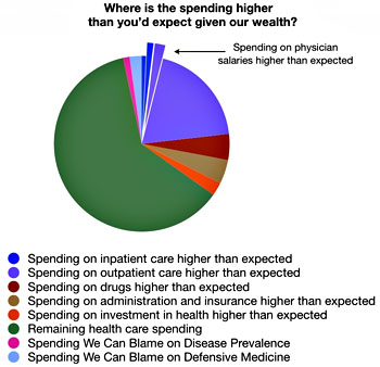
 Dr. Aaron Carroll has finished up his series on healthcare spending, and the chart on the right shows the main areas where America overspends. In short: everywhere. Here is his summary:
It’s been interesting to read the emails I’ve gotten over the last two weeks on this series. Many of you seem to believe I’ve got some secret agenda with respect to how to fix this. I don’t. The truth is that I don’t think there is a simple solution. Some of you on the right think that increased consumer costs will fix the whole thing. It may, for some sectors, but it will do nothing in others. Plus, I think it would negatively affect outcomes. Similarly, tort reform isn’t the answer either.
Some of you on the left think it will be just as easy if you had your way. But even if we went to a single-payer system, and significantly decreased insurance costs, that won’t touch the bulk of the problem. Nor would singling out changes to pharmaceutical spending.
….The final thing is that we have to stop looking for others to blame. We are all to blame. So let’s get past blame entirely, and start dealing with the problem. Our goal isn’t to reduce our spending to that of other countries. Our goal is to reduce spending so that it is in line with GDP. It’s to get spending down to the curve in the above graph. It’s to get spending down to just the green slice of the pie.
The introduction to his series is here, and it includes links to all ten parts. It’s worth a read if you want to get a quick, very readable take on why healthcare in America is so expensive without producing results any better than all the countries that spend less than us.