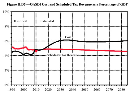
This is apropos of nothing in particular, but I guess that Social Security is going to be back in the news when the president’s deficit commission reports back, so I want to take this chance to post the single most important chart you’ll ever see about the finances of Social Security. Here it is:

This is from page 15 of the latest trustees report. What’s important is that, unlike Medicare, Social Security costs don’t go upward to infinity. They go up through about 2030, as the baby boomers retire, and then level out forever. And the long-term difference between income and outgo is only about 1.5% of GDP.
This is why I keep saying that Social Security is a very manageable problem. It doesn’t need root-and-branch reform. The trust fund makes up Social Security’s income gap for the next 30 years, so all it needs is some modest, phased-in tweaks that cut payouts by a fraction of a point of GDP and increase income a fraction of a point. Here’s a proposal from Jed Graham that’s designed to cut benefits a bit for high earners and encourage them to retire later, and maybe it’s great. I haven’t looked at it in detail. But the point is that the changes he recommends are fairly small. Any plan for fixing Social Security requires only tiny benefit cuts and tiny revenue increases. It’s just not that big a deal.


