 Last night I finally caved in and downloaded Tyler Cowen’s e-booklet, “The Great Stagnation.” I’ll have a substantive review on Monday, but for now I’d like to whine a bit about the business model behind the thing.
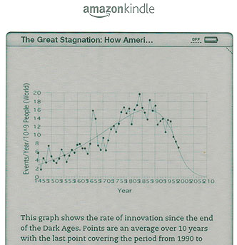
Here it is: if you want to read TGS, you pay Amazon $4 and download it to your Kindle. The problem with this is that the Kindle sucks at rendering tables and charts. The screen cap on the right, for example, shows a chart from Tyler’s book. As Kindle charts go, it’s actually not too bad. But what’s on the X-axis? It appears to start with 1455, and obviously the numbers go up. I get the idea. But the actual details are completely lost. Later in the book there’s another table so badly rendered that I can’t make it out at all.
In the case of “The Great Stagnation,” this isn’t too big a deal. I know what the chart above is getting at, and the table at the end is one I’ve seen before. But other nonfiction books don’t fare so well. Gregory Clark’s Farewell to Alms, for example, relies heavily on lots and lots of fairly complex charts and tables, and they’re rendered so badly (unreadable graphs, table columns that don’t line up, etc.) and placed so haphazardly that they made the book almost impossible to absorb properly. To this day, I’m not sure if my disagreements with his thesis are real, or mere artifacts of the fact that the e-version of the book was really hard to follow. In any case, that was the book that made me give up on the Kindle entirely for nonfiction. Until now.
I’d happily buy an iPad, or maybe even a bigger Kindle, if I thought that graphical elements would be properly rendered with a little more screen real estate. But I have a feeling they aren’t, and I don’t feel like examining nonfiction books closely before I buy them to see if they rely on graphical elements and should be purchased in paper form or are primarily text and can be safely read on the Kindle.
Besides, a pretty good business model already exists for pieces like Tyler’s: sell it to a magazine. It’s a little long, maybe, but I’ll bet it could have been sweated down into a long magazine piece, especially since chapters 3 and 4 could profitably have been reduced to a few hundred words each. The advantages for Tyler would have been (a) great graphics designed by a pro and (b) a guaranteed wide audience. The advantages for me would have been (a) excellent readability and (b) I probably could have read it for free, increasing my consumer surplus by $4. This would have been a pareto-optimal state for all of us.
Anybody else have the same problem with the Kindle? Is the bigger version better? How about the iPad? I don’t care about fiction. That already works fine. I just care about whether complex nonfiction renders nicely. What say ye, commentariat?
UPDATE: In case you’re wondering how I got a screen cap of a Kindle book, I didn’t. I just put the Kindle on my flatbed scanner and scanned the whole thing. Photoshop did the rest. I’m not really sure if there’s a better way of doing it.


