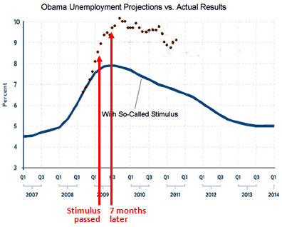
Over at Cato, Daniel Mitchell posts the chart below and says it shows just how worthless Obama’s economic stimulus package was. “As you can see, the unemployment rate is about 2.5 percentage points  higher than the White House claimed it would be at this point.”
This has become such a popular meme on the right that I suppose it’s pointless to argue with it. But seriously. This chart shows the exact opposite of what Mitchell claims. I mean, just take a look at the data itself. By the time the stimulus bill had passed, unemployment was already a point higher than projections. By the end of Q3, about the earliest point that anyone thinks the stimulus might have really started working its way through the system, unemployment was already nearly two points higher. All of this happened before the stimulus could plausibly have had any significant impact on employment, either positive or negative.
(CBO’s tiny estimates for Q2 and Q3 of 2009 are here.)
The post-collapse recession, unfortunately, was simply far bigger than the Obama administration predicted.
After that, unemployment quickly peaked and started to come down. Did it come down faster because of the stimulus? Most models of the economy say yes, though feel free to argue if you prefer a different model. But what you can’t argue is that the stimulus was ineffective because it didn’t have an effect before it even started. This is economics, after all, not science fiction. What this chart really suggests isn’t that the stimulus didn’t work, but rather that (a) the 2008-09 recession turned out to be way worse than anyone thought in late 2008, and (b) the stimulus package was too small. We’re still paying the price for that mistake.


