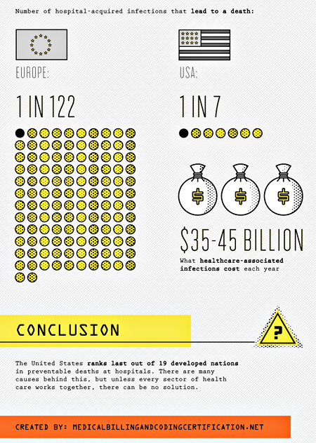
UPDATE: This chart appears to be completely wrong. Apologies. More details here.
Via Chris Bodenner, this graphic compares fatal hospital infections in the U.S. to those in Europe. This might disturb you at first, but remember: the free market is always right, so clearly we’ve collectively made a rational choice here. We’ve decided that although our healthcare costs are far higher than in Europe, this is worth it in return for far higher death rates from hospital infections. Best healthcare in the world, baby!
More graphic at the link.


