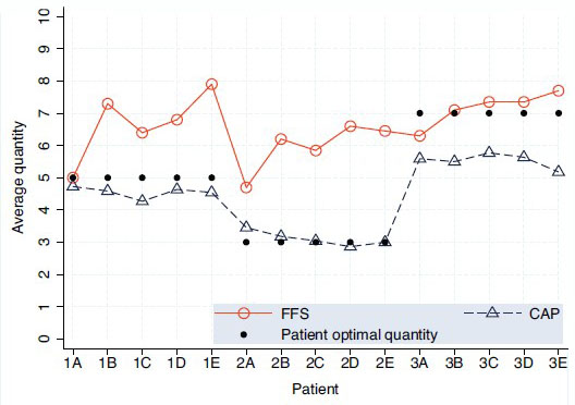
This chart, via Austin Frakt, is one of the weirdest I’ve seen in a while, so I’m going to inflict it on you just as an object lesson. (In what? you ask. I’m not sure. Ask me again some other time.)
The question at hand is: do doctors provide more optimal levels of care if they’re paid on a fee-for-service basis or a capitation basis? On an FFS plan, they get reimbursed for every test and procedure they order, so you’d expect that they might provide too much care. On a capitation plan, they get a flat payment for each patient, so you’d expect that they might provide too little care. According to a clever recent experiment, both of these things are true, but in a surprising way.
In the chart below, Type 1 patients (1A though 1E) are average, Type 2 are healthier than average, and Type 3 are sicker than average. The black dots show “optimal” care levels for each type of patient, the red line shows the actual care provided under FFS, and the blue line shows the actual care provided under capitation. (Well, “actual” in an experimental sense, anyway. See note below.)

So what’s the result? For average patients and healthy patients, capitation is great. Doctors working under this system provide almost exactly optimal levels of care, while doctors working under FFS strongly overtreat.
But what about patients who are sicker than average? For them, FFS doctors provide an almost exactly optimal level of treatment while capitation docs severely undertreat.
Apparently, as long as the level of treatment required (say, $3,000 worth) is less than the capitation payment (say, $5,000), doctors will provide all the care that’s appropriate even if it means earning less money on each patient. But if the level of treatment goes above the capitation payment, they don’t. They aren’t willing to actually lose money on a patient.
Ideally, then, we’d like to compensate doctors on a capitation basis for most patients, but on an FFS basis for the 5-10% of the sickest patients. Figuring out just how to do that, however, is a considerable challenge.
NOTE: This was an experiment with medical students, not a real-life study with actual doctors. So obviously take it with a big grain of salt. Still, there was actual money at stake, and the design of the experiment was pretty good. It’s not a slam-dunk case by any means, but it’s highly suggestive of how things might work in real life.
UPDATE: An email exchange with Austin suggests that I should explain a couple of things. First, by “weird” I only meant that the chart is fairly complex and hard to understand at a glance, not that the results themselves are weird. Actually, the results seem pretty straightforward.
Second, those dollar figures I used have nothing to do with the chart or the experiment. They were just illustrative, on the assumption that for average and healthy patients the cost of proper care is less than the capitation payment, while for sick patients the cost of proper care is higher than the capitation payment. Apologies if this was unclear.


