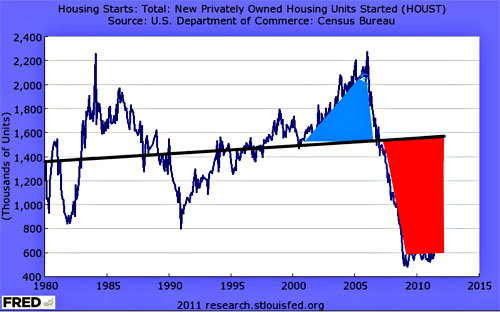
Via Brad DeLong, this chart shows how much housing was “overbuilt” during the aughts compared to how much it’s been underbuilt since the collapse of the housing bubble. As you can see, on net, we’re now way, way underbuilt, which means we should be all set for a renaissance of housing construction. Assuming anyone still has the money to buy a house, that is.
Of course, there’s another way to look at this: why did home prices rise so furiously even though we were building lots of homes? That’s odd, no? Simple supply and demand suggests that when the supply of something goes way up, its price should go down. But it didn’t — and it’s not because the fundamental demand for housing suddenly skyrocketed. It was because Wall Street could make a lot of money from a housing bubble, so they invented the financial artistry to get one. Thanks, guys!


