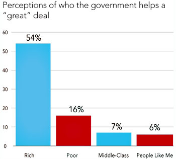
This chart from the Pew Economic Mobility Project is actually a few months old, but it seems newly relevant in light of the Occupy Wall Street protests. If you want to know why people are angry, this tells the story. If you want to know why people don’t think much of government, this tells the story. If you want to know why people are overwhelmingly in favor of increasing taxes on the rich, this tells the story. Basically, this chart tells a lot of stories.
