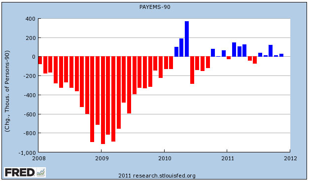
The chart below shows net job growth every month since 2008. Why net? Because the U.S. population increases every month, which means you need a certain number of new jobs just to tread water. This chart subtracts that out to show the true net growth in employment.
I’ve run this chart before, but there are a couple of changes this time. First, per Dean Baker, I’m now using 90,000 as the number of jobs needed to keep pace with population growth. Second, I finally got off my ass and automated the whole thing on FRED instead of redrawing it every time I do this. You can link to it here and juggle the numbers yourself if you feel like it.
Bottom line: the number of net new jobs added in November was about 30,000. That’s better than zero, but not a lot better.


