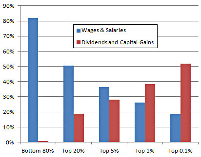
While we’re all waiting for the Iowa straw poll to finish up, here are some new income inequality charts for you to munch on. These come from a new CRS report, and the first one shows where most of us get our income. For 80% of us, the answer is: almost all of it comes from ordinary wages and salaries. We get a grand total of 0.7% of our income from dividends and capital gains.
For the top 0.1%, it’s flipped around. They get less than 20% of their income from ordinary wages and more than half from dividends and capital gains. So when Republicans eagerly insist on reducing or eliminating taxes on dividends and capital gains, this chart shows you who benefits. Most of us get nada, but the very rich benefit handsomely.

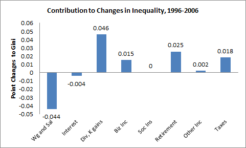
Got that? Onward, then. This next chart comes from Jared Bernstein, based on the same CRS report, and it shows how various kinds of income contributed to growing income inequality between 1996 and 2006. Overall, America’s Gini coefficient, which measures income inequality, increased by 0.057 points between 1996 and 2006. Of that increase, most comes from dividends and capital gains, which became a higher percentage of the pay of the rich, and taxes, which went down a lot for rich people.

There’s more detail at the link, but you get the picture. For the rich, the amount of their income that comes from capital gains went up, while the taxes they paid on their capital gains went down. As a result, income inequality zoomed ever higher. Pretty sweet deal, no?


