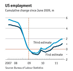
Today is my day for publishing charts that I find interesting but don’t quite know what to think of. As you all know, government estimates of job losses and gains each month are released a few days after the end of the month. Then they’re  revised, and then, two months after the initial estimate, they’re revised one last time. Mostly, though, only the first estimate ever gets much attention.
But those revisions matter, as Ryan Avent shows in the chart on the right. The light blue line shows employment changes based on the third and final estimate, and compared to the initial estimates (dark blue) it shows that the Great Recession was both deeper than we thought and that the recovery has been more robust than we thought. On the downside, we lost something like 6.5 million jobs instead of 5.5 million, but since then we’ve gained something like 3 million jobs instead of 2 million. (As always, the little spike in 2010 is due to temporary census jobs.)
In one sense this doesn’t matter. Both lines show that we’re about 3.5 million jobs below the previous peak. And neither line shows much acceleration in the jobs picture over the past year. Still, while this chart shouldn’t change our minds a lot about how well the economy has been doing recently, it does suggest there’s a little more cause for optimism than the headline numbers have suggested in real time.


