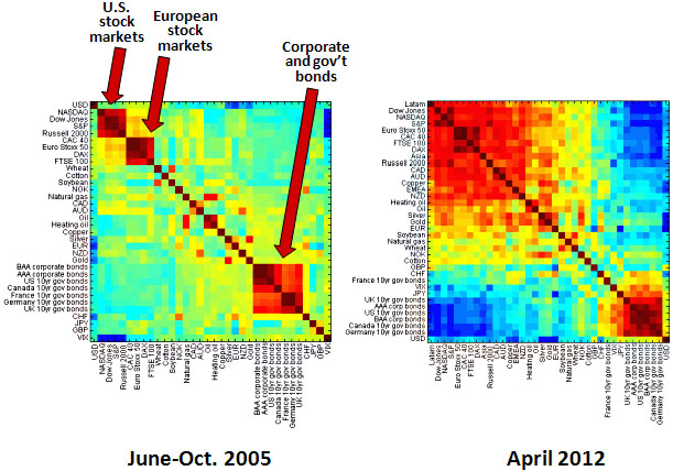
Via the Financial Times, here’s an interesting bit of color coded data from HSBC Global showing the level of correlation between various asset classes. The version on the left is from 2005, and it shows about what you’d expect. Deep red means a pair of asset classes are highly correlated — that is, when one goes up or down, the other moves in the same direction — and the red square at the top left represents various U.S. stock market indexes. Unsurprisingly, when the NASDAQ goes up, so do the Dow Jones and the S&P 500. The red square next to it is European stock markets. And the red square at the bottom represents corporate and government bonds. When one kind of bond moves up or down, so do all the rest.
No surprises there. But take a look at the version on the right from April 2012. Practically everything in the top half is moving together. At the bottom right, bonds are moving together even more tightly than before. And stocks and bonds (bottom left) are moving tightly in opposite directions. There’s a bit of stuff in the middle that’s not correlated with anything else, but that’s all.
What this means is that it’s hard to diversify a financial portfolio these days because everything is moving in sync. HSBC’s view is that this is because the world economy is in such fragile shape that basically everything now depends on how well governments cope. If they cope well, the global economy will recover smartly and pretty much all asset classes will do well. If they cope poorly, everybody and everything is screwed. In other words, when you buy an asset these days — any asset — you’re not really making a bet on the asset itself. You’re making a bet on how well the governments and central banks of the world handle the current economic mess. No wonder everyone’s so nervous. There’s no escape from the Great Recession.
