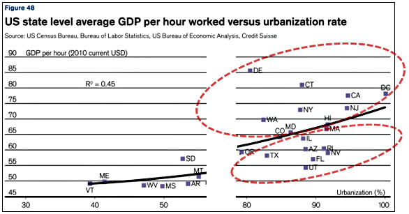
Alex Tabarrok posts a chart today showing that heavily urbanized states tend to be richer than less urbanized states. The correlation is impressive, but Ryan Avent asks us to focus on just the right hand part of the chart, which shows only the most urbanized states:

Ryan suggests that we look at the states above the line (wealthier than expected) and those below the line (poorer than expected):
In the rich, productive bunch, we have California, Connecticut, the District of Columbia, Maryland, New Jersey, New York, Washington, and, just hanging below the line, Massachusetts. Sitting well below the line we have places like Arizona, Florida, Nevada, and Texas. It’s striking how dispersed wealth is at the high urbanisation end relative to the low urbanisation end; the gap between similarly urbanised states like Connecticut and Florida is enormous.
What accounts for this? Ryan has a couple of ideas, but as it turns out, the Credit Suisse report that this chart is taken from addresses this very question in the context of different countries. Why do some highly urbanized countries lie so far below the trend line?
A clue lies with the most disproportionate distribution of income for any particular geographical groups of countries in our sample….Government policy to improve income distribution and social mobility appears to be as essentential an ingredient to ensure successful patterns of urbanization, and its associated improvements in living standards, as sufficient infrastructure investment and city planning.
Maybe something similar is true of U.S. states. States that promote social mobility, discourage excessive income inequality, and are willing to invest in broad-based infrastructure, do well. Those that don’t, don’t.


