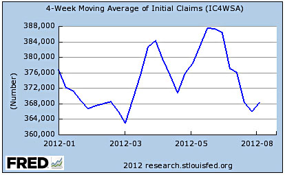
Steve Benen put up his weekly chart of initial unemployment claims today, and I thought it might be useful to put up a slightly different version of the chart. This one is a 4-week moving average, so it removes a bit of noise from the figures, and it  starts in January, so it shows us only how the economy has been doing this year.
Unemployment claims have dropped dramatically since the peak of the recession in 2009, but as you can see, they haven’t really budged much since the beginning of the year. They’re bouncing up and down around a mean of 370,000 or so, and don’t show much sign of getting down into the neighborhood of 320,000, where we’d like them to be. This is hardly surprising news or anything, but it’s yet another sign that we should be doing a lot more to shift the economy into a higher gear.


