A Couple of Graphical Lessons From the Government’s Huge Hospital Chargemaster Data Dump

Get your news from a source that’s not owned and controlled by oligarchs. Sign up for the free Mother Jones Daily.


Today the government released data showing how much different hospitals charge for the same procedure. I’ve been struggling since last night to figure out what to say about this, since in one way there’s no news here. The fact that there are huge disparities has been well known for quite a while. This new data simply lays it out in more mind-numbing detail than usual. For now, then, I’m just going to offer up a couple of good graphical presentations that I’ve seen. The first is your basic map, courtesy of the New York Times. I zoomed in on Los Angeles here:

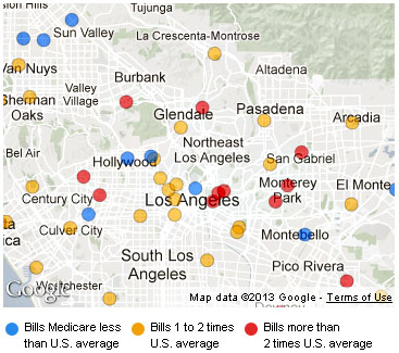
Take a look in the hospitals in the middle. There’s a disparity of 2-4x in pricing between hospitals that are only a couple of miles apart. Why? Some is probably due to the nature of the cases they take, and the amount of unpaid work they do. But 2-4x? What accounts for this? Part of the answer comes from the chart below, courtesy of the Washington Post:

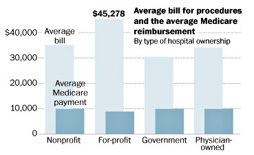
This doesn’t explain everything, but it explains a fair amount. The private sector, we’re told, is always more efficient than the public sector. Competition, you understand. But that doesn’t seem to be the case in the healthcare industry. I will allow you to draw your own conclusions.

Don’t just click away.

We need your help. We’re halfway through our Summer Membership Drive, and only $35,000 toward our $200,000 goal. But there’s good news: This week only, every donation will be doubled, up to $50,000, thanks to a generous reader.

That’s twice the impact for intrepid reporting that peels back the layers to publish the truth—and the context you need to break it all down. It’s twice the fuel for investigations on voting rights and justice, critical in this midterm election year. And it’s twice the power for exposing the chaos and corruption of a White House trying to control the narrative.

This is a pivotal moment in our nation, with democracy on the line, and we can only do this work because readers like you step up. Every donation, of any amount, makes a difference here. And every donation will be doubled.

We cannot do this work without you. Join the fight. Double your donation to defend democracy.

We Recommend

Latest

Sign up for our free newsletter

Subscribe to the Mother Jones Daily to have our top stories delivered directly to your inbox.

Get our award-winning magazine

Save big on a full year of investigations, ideas, and insights.

Subscribe

INDEPENDENT. BECAUSE OF YOU.

Mother Jones has no billionaires calling the shots—just readers like you making fearless reporting possible

Donate