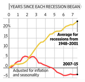
I don’t really have any good hook for posting this chart, but it’s one of the most important ones you’ll ever see. It’s from the Wall Street Journal and it shows total government spending (state + local + federal) during the recession and its aftermath:

For about a year following the Obama stimulus, total spending was a bit higher than average for recession spending. But after that, spending fell steadily rather than rising, as it has after every previous recession. The result: a sluggish recovery, persistent long-term unemployment, and anemic wage growth.
Instead of responding to a historically bad recession with a historically strong stimulus, we responded with the weakest stimulus ever. Government spending is now more than 25 percentage points lower than normal. If you want to know why the recovery has been so feeble and unsteady, this is it. Republican presidential candidates, please take note.


