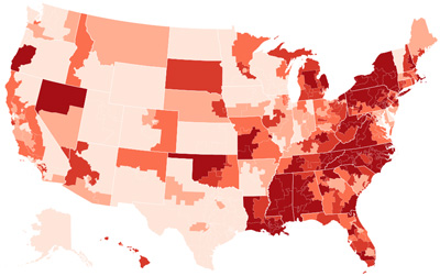
 Let’s play a game! What is this a map of?
- Popularity of Adele vs. Taylor Swift in 2015
- Rain patterns and drought as a consequence of global warming in 2015
- Support for Donald Trump among Republicans in 2015
- Change in cable TV penetration during 2015
- Support for using ground troops against ISIS in 2015
The answer is 3, support for Donald Trump among Republicans. But I tricked you. It’s also a map that shows where racially-charged internet searches are most common. Here is Nate Cohn on Trump’s support:
His geographic pattern of support is not just about demographics — educational attainment, for example. It is not necessarily the typical pattern for a populist, either. In fact, it’s almost the exact opposite of Ross Perot’s support in 1992, which was strongest in the West and New England, and weakest in the South and industrial North.
But it is still a familiar pattern. It is similar to a map of the tendency toward racism by region, according to measures like the prevalence of Google searches for racial slurs and racist jokes, or scores on implicit association tests.
But remember: no fair confusing correlation and causation! This might just be a big coincidence.


