Earlier today I wrote about retirement income in the United States, and that got me curious about how we compare to other countries. The obvious source for this is an international organization that does its best to make apples-to-apples comparisons, so I headed to the website of the OECD, the “rich countries club.” (I don’t really care how we compare to Chad. I want to know how we compare to peer countries like France and Japan.)
This in turn led me to “Pensions at a Glance,” which turned out to be an enormous misnomer: the 2015 edition is 374 pages long. I haven’t read the whole thing, of course, but I did find plenty of interesting stuff. I’m going to highlight one chart today, and maybe I’ll do others throughout the week.
So how do we compare? The answer, unsurprisingly, is: It’s complicated. There are lots of ways of comparing retirement income, and they produce different results. But there’s a single broad measure that gives a rough idea of how generous each country is: the percentage of GDP spent on pension programs. In the United States, that’s Social Security (public) plus 401(k)s, IRAs, etc. (private). Other countries give their programs different names, but they all employ a combination of public and private spending.
By itself, though, that’s not enough. Countries with more elderly people are obviously going to spend more. So you want to adjust the GDP number by how many people are retired. The OECD report doesn’t do this directly, but it does provide the old-age dependency ratio for each country, which is a good proxy. The higher the number, the more retired people a country has.
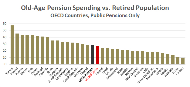
So all we have to do is divide the GDP number by the OADR number for each country. This provides a “retirement index” that indicates how generous each country’s retirement is. Here it is for public pensions only:

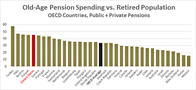
And here it is for all pension income, both public and private:

As with many other things, the United States relies more heavily on private spending than most rich countries. If you compare Social Security to public pensions in other countries, we’re about average. If you compare all pension income, our retirees are better off than nearly everywhere else.
Now, these are only average numbers. They don’t tell us anything about how rich retirees compare to poor ones. Social Security, for example, tends to favor poorer retirees, while private pensions favor richer ones, and it’s not easy to combine them to get a comprehensive distribution of retirement benefits. However, the OECD report has some other charts that come close to doing this, and I’ll see if I can extract one for tomorrow. In the meantime, make what you will of this raw data.


