This chart is a follow-up to my post last night about response rates in polls. It’s from the paper that started the whole thing, published earlier this year by Andrew Gelman and three other researchers. They analyzed the 2012 campaign, and what they found was that polls were far more variable than actual voting intentions. The red line is what the polls looked like in real time. The black line is what they look like when you control for different response rates:
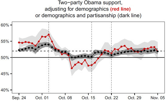
The first dotted line is the first debate. Remember how Obama did so poorly and plummeted in the polls? It turns out he didn’t, really. Obama fans just stopped responding to polls, producing the illusion of a 10-point collapse. In reality, he only dropped about 4 points. In fact, during the last six weeks of the campaign, Obama’s support was never more than a couple of points away from 52 percent.
Moral of the story: even poll averages bounce up and down misleadingly. In reality, there’s probably no more than two or three points of change in actual voting intentions during the last month of the campaign. And in the last week? Practically none at all.


