A few days ago the New York Times ran a big front-page story about GMO crops. Roughly speaking, there were two takeaways: GMO crops don’t improve yields and don’t cut down on pesticide use. So why bother?
That sounded interesting, but I decided not to write about it. The story was pretty shallow in its use of statistics. It assumed that you can compare different countries without controlling for anything (different soils, climates, crops, etc.). And it seemed to suggest that American farmers must be idiots, because they keep buying GMO seeds even though they’re worthless. Put together, this was a little too much for my spidey sense, and it would have taken a long time to educate myself enough to really figure out what was going on. So I passed.
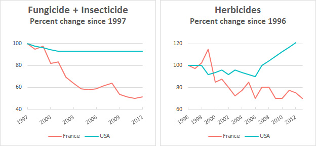
Yesterday, however, Nathanael Johnson of Grist took a close look at the Times piece and concluded that it was pretty misleading. You can read Johnson’s piece if you want all the gory details, but it contained a pretty interesting example of how to mislead with statistics, which I figured I should pass along. The Times story says that in the US, despite the wide use of GMO seeds, use of insecticides has fallen but the use of herbicides has gone up. In France, by contrast, where they don’t use GMO seeds, “use of insecticides and fungicides has fallen by a far greater percentage — 65 percent — and herbicide use has decreased as well, by 36 percent.” Using data from Andrew Kniss, here’s what this looks like in chart form:
It does indeed look like France is doing pretty well. But what if you look at the raw numbers, rather than percentages? Here’s a chart from Kniss:
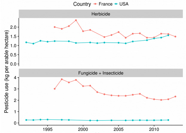
In the case of herbicides, France started at a high level, and has only recently caught up to the US. In the case of insecticides, France started out way, way higher than the US and is still way higher despite their recent reductions. Looked at this way, it’s clear that France hasn’t actually done that well. What’s more, I had to cherry pick starting and ending years in the top set of charts in order to make France look as good as it does. Plus there’s this, from Kniss:
It is true that France has been reducing pesticide use, but France still uses more pesticides per arable hectare than we do in the USA. In the case of fungicide & insecticides, a LOT more. But a relatively tiny proportion of these differences are likely due to GMOs; pesticide use depends on climate, pest species, crop species, economics, availability, tillage practices, crop rotations, and countless other factors….Given all of these confounding factors, I wonder why France was singled out by Mr. Hakim as the only comparison to compare pesticide use trends. Pesticide use across Europe varies quite a bit, and trends in most EU countries are increasing, France is the exception in this respect, not the rule. In the early 1990’s, France was using more herbicides compared to almost every other country, so it shouldn’t be too surprising that pesticide use decreased as formation of the EU began to standardize pesticide regulations after 1993.
So what’s the best comparison to make: percentage change or raw volume? In this case, presenting only the percentage change leaves you with a very misleading impression. Presenting raw volumes, however, makes everything pretty clear. You can see that France started out far higher than the US and that its use of herbicides and insecticides has been decreasing. So why present only percentages?
POSTSCRIPT: If you click on the chart pack in the Times story, you will actually find charts showing raw volume of pesticide use in the US and France. However, they’re shown in two different charts, using different units, and broken up into different categories. If you were deliberately trying to make a comparison nearly impossible, this is how you’d do it.


