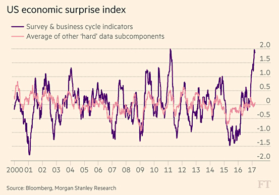
Over at the Financial Times, Robin Wigglesworth has an interesting chart to show us. It’s a little hard to decipher, though, and takes some explaining. First, here’s the chart:

The pink line is “hard” economic data: employment rates, GDP growth, etc. The purple line represents “soft” data: things like consumer sentiment, purchasing manager optimism, etc. Roughly speaking, pink is how things are and purple is how people feel.
The fist thing to notice is that the hard data doesn’t bounce around very much. It mostly stays in a band between -0.5 and +0.5. (I have no idea what those numbers represent. Some kind of overall index, I imagine.) The animal spirits data, however, is like a kid’s yo-yo: it routinely shoots up and down from -1.5 to +2.0.
The second thing to notice is that these indexes mostly move in tandem. When the hard data goes up, the soft data goes way up. When the hard data goes down, the soft data goes way down. People react very strongly to even modest changes in the economy.
And then there’s 2016-17. After a modest slump, the hard data has been ambling along at zero for the past year. But starting around the election, the soft data suddenly went sky high. There’s nothing in the economic data to support this, but the Trump election seems to have filled the investor class with overwhelming optimism.
So what happens when reality sets in? There’s no special reason to think the economy is going to take off anytime soon, and Trump’s obvious bumbling will eventually sink in to everyone. At that point, the animal spirits are set to come crashing down.
What will that do to the actual economy? Maybe nothing. Maybe the actual economy really does respond solely to macro phenomena and animal spirits have nothing to do with it. That’s certainly been the case as animal spirits have skyrocketed. Then again, maybe the economy does react to animal spirits plummeting. This is not a real-life experiment I’m especially eager to see play out.


