Christopher Ingraham asks, “Is the money we’re spending on health care keeping us alive?” It’s this chart that gives him pause:
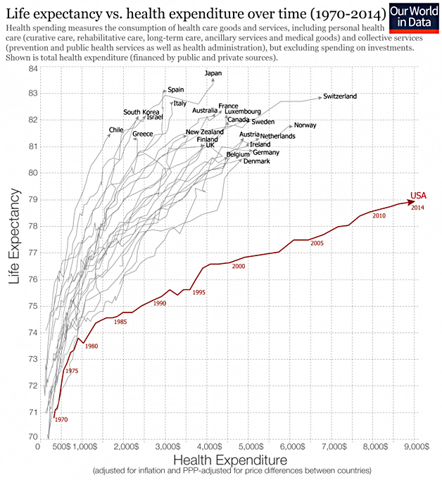
This is a dramatic chart, for sure. But I’m not sure it highlights the right issue. The US spends a lot more on health care than other countries, but that’s not because we provide better or worse health care. We just pay more for the same stuff. We pay doctors more and we pay nurses more. We pay more for drugs, more for hospital stays, and more for tests. This is a consequence of a mostly private health care system that doesn’t control costs very well, but it says nothing about the quality of care.
Instead, I would draw your attention to this chart:
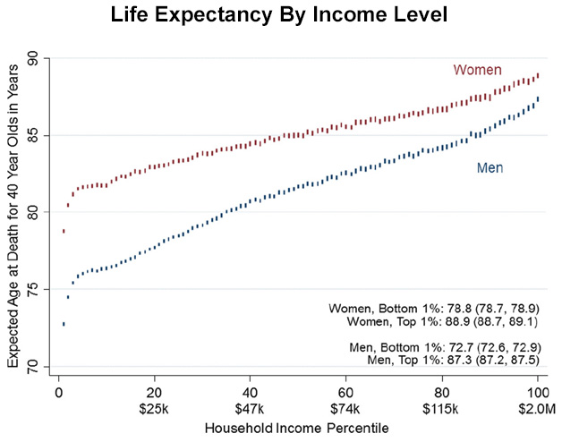
The difference in life expectancy between the top and bottom is ten years for women and a stunning 15 years for men. Nor do you need to look at the very top to match European life expectancies. A merely average American has a life expectancy of 82 years, right in line with other advanced countries.
So here’s the question: I assume that every country shows a decline in life expectancy as you get poorer. But do other countries show the astonishing decline we have in the US? I can’t find an authoritative analysis of this, but I scanned through some reports from different countries and it looks to me like the income difference in most places is half to two-thirds of the US difference.
This is where I suspect our health care system goes awry: in quality of care to the poor. Compared to other advanced countries, it’s terrible, and that shows up in the life expectancy numbers for the poor.
This is testable with the right statistics. In particular, I’d be interested in seeing the chart at the top not for overall life expectancy, but for life expectancy of those with median incomes. Does any such thing exist?


