Binge Drinking and Chart Geekery

I was slightly under the weather today and had nothing better to do than noodle around on the computer, so let’s do some more chart geekery. This morning a reader sent me a link to this chart in the New York Times about binge drinking:

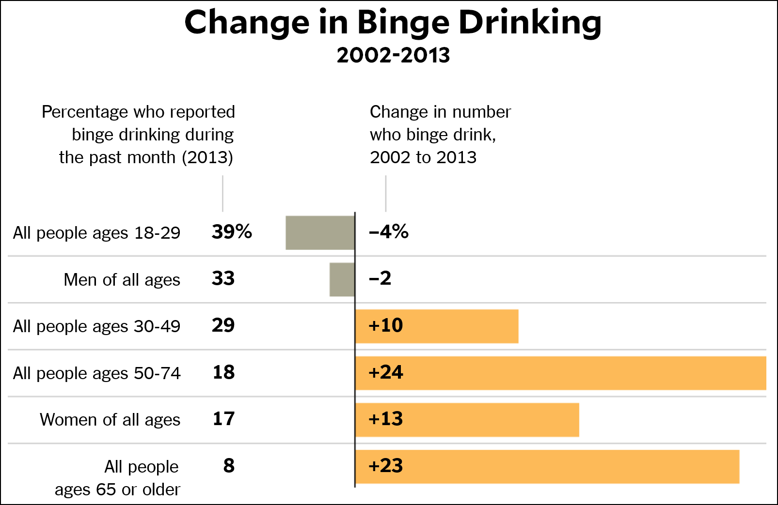
That’s one confusing chart! I stared at it for a while, trying to figure out how binge drinking could go down 2 percent among men and up 13 percent among women, resulting in a net change for all people of -4 percent. After about a minute I finally realized that the top bar was only for people age 18-29. Basically, this is such a mishmash of different ages and genders that it’s hard to compare anything. Why not just do this?

You could pretty easily add other age categories if you want, or a bar for all ages. Or a chart showing both 2002 and 2015 rather than just the change. It’s not like it would take up any more room than the other chart. The data is easily available online, so why not just present it all?

I dunno. But my reader had a different complaint. Take the bar for women over 50. The number who report binge drinking in the previous 30 days has gone up from 17 percent to 31 percent. What’s the best way to represent that? It’s a difference of 14 percentage points, but 82 percent. I think the latter is more informative, but it’s always confusing when you compare percentages. It’s easy to see that an increase from, say, $17 to $31 is 82 percent, but less intuitive that an increase from 17% to 31% is also 82 percent. But it is.

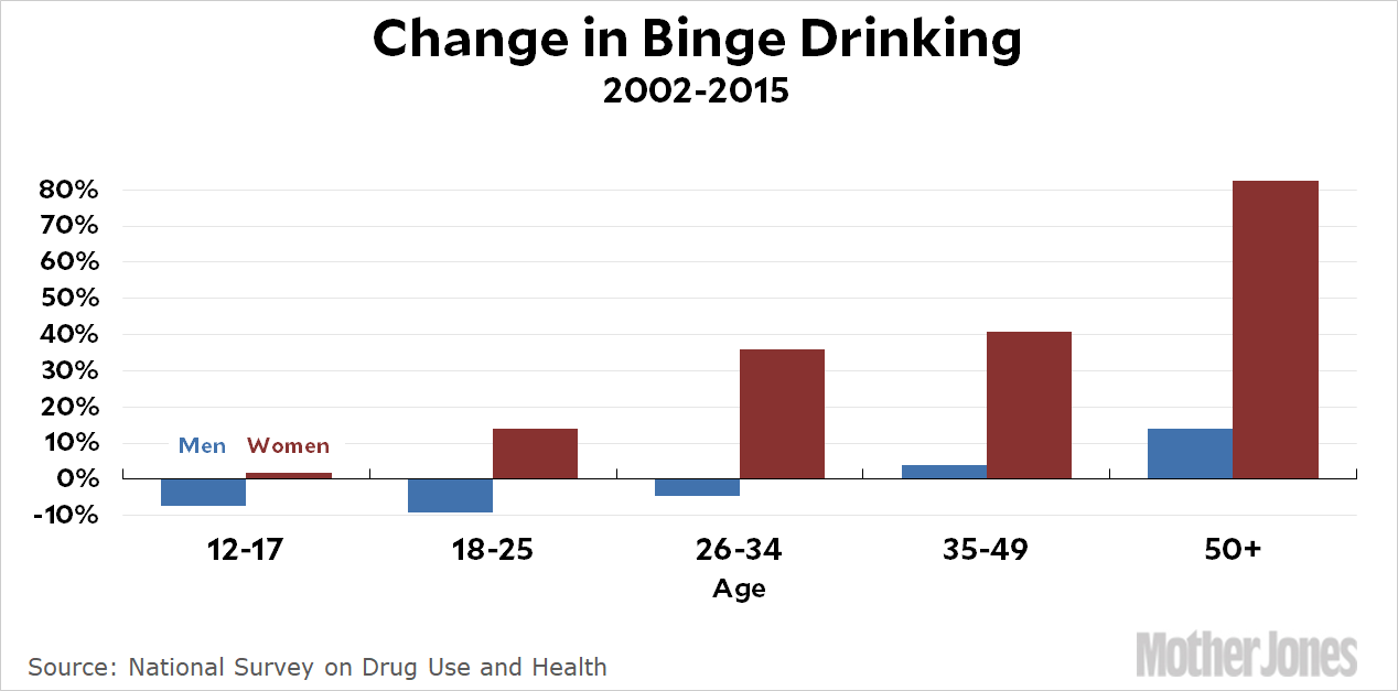
POSTSCRIPT: Alternatively, you could lard up your chart with the kitchen sink:

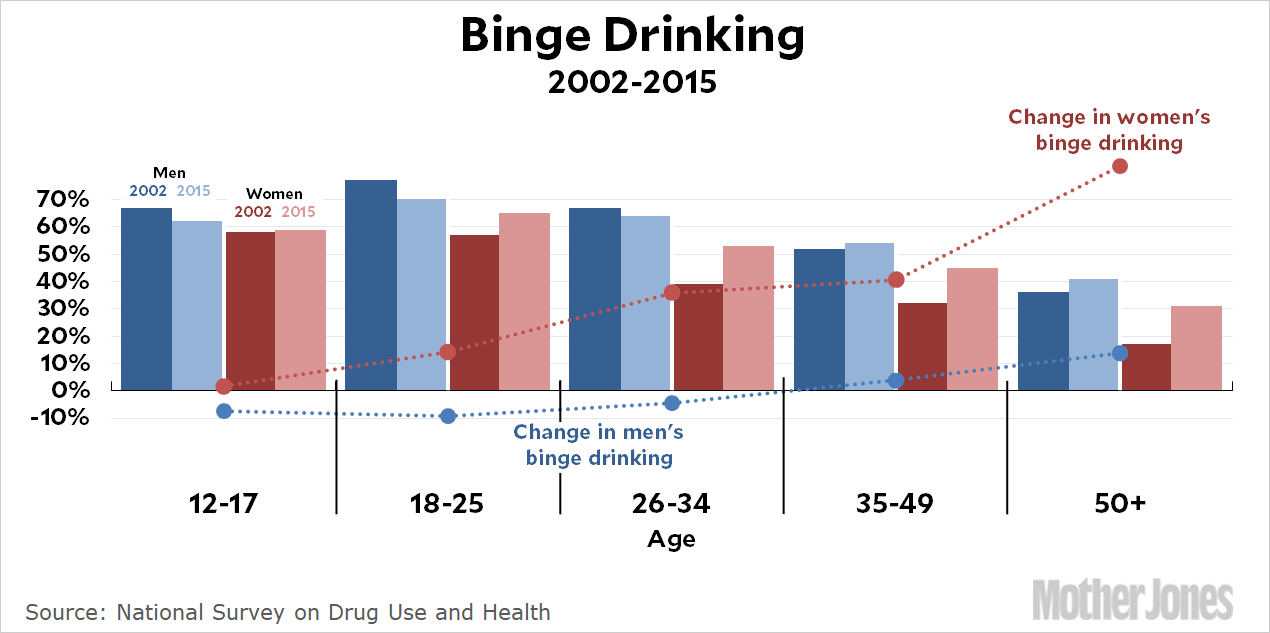
On the upside, this one shows the absolute percentages of binge drinking reported by every age/gender combination, as well as the growth rate in binge drinking since 2002. On the downside, it’s pretty hard to parse for a casual reader.

It also has way different numbers than the Times chart. I don’t know why that is. Maybe I bollixed up the data. But it seems pretty straightforward. Here’s the crosstab I used for the 2015 data:

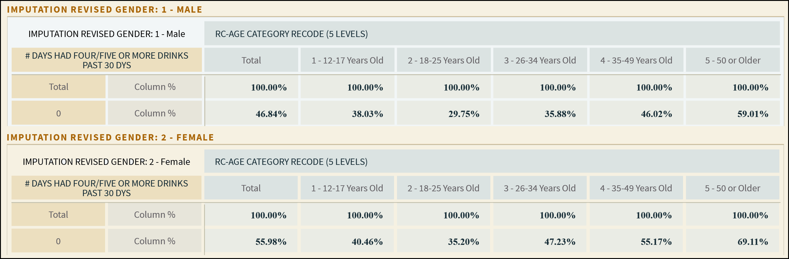
If 46.84 percent of males reported zero days of binge drinking, then 53.16 percent reported binge drinking at least once. But the Times chart says 33 percent. I don’t know what’s going on.

THE FACTS SPEAK FOR THEMSELVES.

At least we hope they will, because that’s our approach to raising the $350,000 in online donations we need right now—during our high-stakes December fundraising push.

It’s the most important month of the year for our fundraising, with upward of 15 percent of our annual online total coming in during the final week—and there’s a lot to say about why Mother Jones’ journalism, and thus hitting that big number, matters tremendously right now.

But you told us fundraising is annoying—with the gimmicks, overwrought tone, manipulative language, and sheer volume of urgent URGENT URGENT!!! content we’re all bombarded with. It sure can be.

So we’re going to try making this as un-annoying as possible. In “Let the Facts Speak for Themselves” we give it our best shot, answering three questions that most any fundraising should try to speak to: Why us, why now, why does it matter?

The upshot? Mother Jones does journalism you don’t find elsewhere: in-depth, time-intensive, ahead-of-the-curve reporting on underreported beats. We operate on razor-thin margins in an unfathomably hard news business, and can’t afford to come up short on these online goals. And given everything, reporting like ours is vital right now.

If you can afford to part with a few bucks, please support the reporting you get from Mother Jones with a much-needed year-end donation. And please do it now, while you’re thinking about it—with fewer people paying attention to the news like you are, we need everyone with us to get there.

payment methods

We Recommend

Latest

Sign up for our free newsletter

Subscribe to the Mother Jones Daily to have our top stories delivered directly to your inbox.

Get our award-winning magazine

Save big on a full year of investigations, ideas, and insights.

Subscribe

Support our journalism

Help Mother Jones' reporters dig deep with a tax-deductible donation.

Donate