A couple of days ago I posted a chart showing that the black unemployment rate was dropping faster than the white unemployment rate. I got into an email conversation with a reader about this, who suggested looking at the labor force participation rate as a different, possibly better metric of black employment. Here’s the basic chart showing the difference between black and white participation rates:
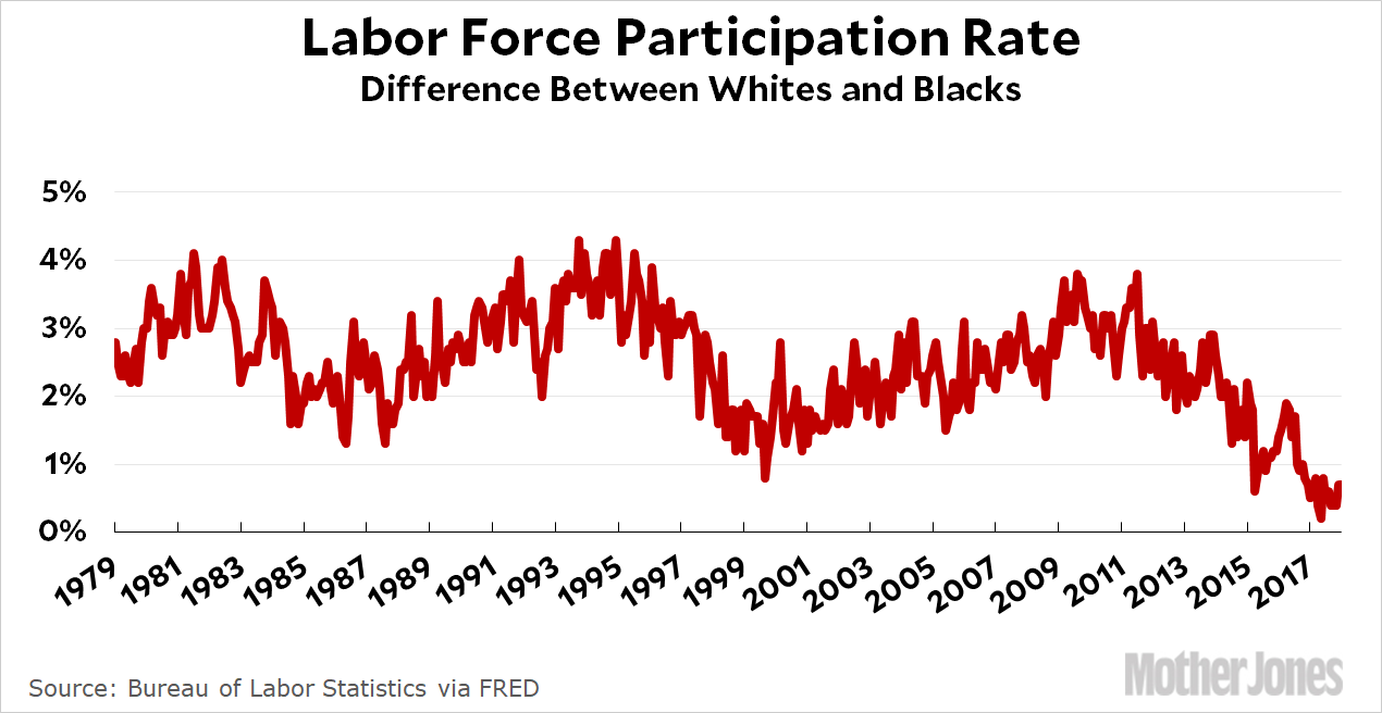
Participation rates vary with the economic cycle, but for more than three decades the difference between whites and blacks has been around 2-3 percentage points. Until 2011, that is. Starting then, the difference narrowed and kept on narrowing. Today it’s close to zero. Here’s a closeup of the past few years:
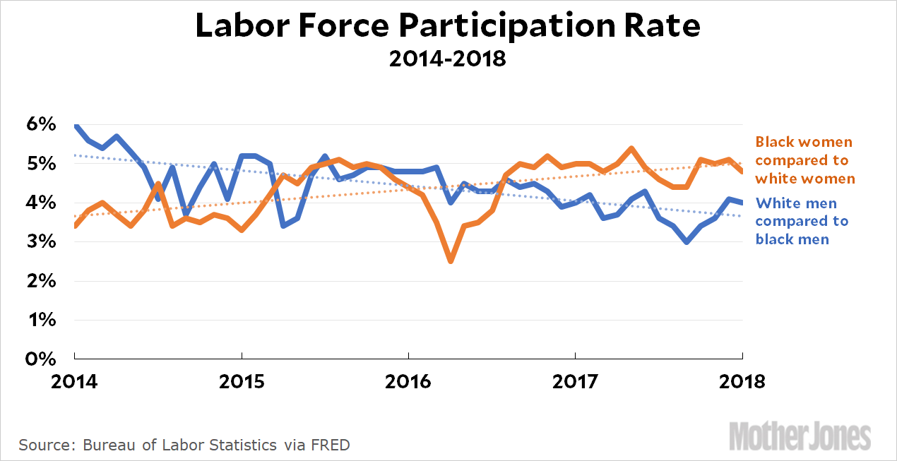
Black women have always worked more than white women, and over the past five years they’ve increased that gap by about 1.5 percentage points. Conversely, black men have always worked less than white men, but over the past five years they’ve narrowed that gap by about 1.5 percentage points. Together, that’s almost completely closed the overall racial gap.
I’m not really sure what lessons, if any, to take from this. Generally speaking, blacks close the job gap during economic expansions, which suggests that a lot of companies are reluctant to hire them until the economy gets good enough that they just can’t find white workers anymore. It also suggests that white women can afford to drop out of the labor force more easily than black women when times are good.
I don’t know if those are the right conclusions to draw from the data, and the differences are fairly small to begin with. Blacks may be paid considerably less than whites, but they’re employed at close to the same rate. In any case, I figured I’d post these charts as a point of interest, even if I’m not entirely sure what to make of them. Comments welcome.
UPDATE: I’m getting some flak for my choice of statistics. Here’s the deal: LFPR measures everyone who works or wants to work. The employment-population ratio measures only those who actually have jobs. LFPR is a better measure of general labor market engagement since it includes anyone who hasn’t given up completely, which is why I like it. However, EPOP specifically measures who has jobs, which makes it a better measure of…who has jobs.
You can make a case for either one, but for our present purposes it doesn’t matter much because they both tell similar stories. Here’s the same chart as above using EPOP instead of LFPR:
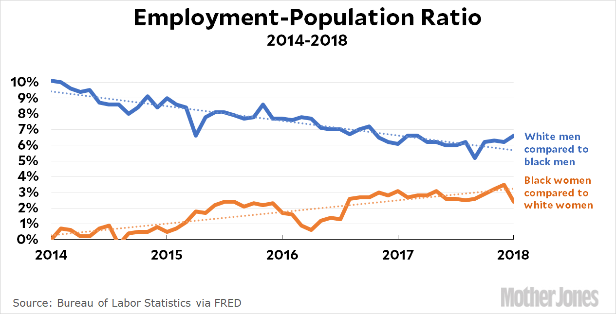
Since 2014, black men have narrowed the empop gap with white men by 3-4 points. Black women have expanded their lead over white women by 2-3 points. The overall black-white gap now stands at about two percentage points. It’s a big swing.
However, I’ve changed the headline since the gap is zero only by one measure and not the other. Both have gone down substantially, so “plummeted” is a safe description for either one.