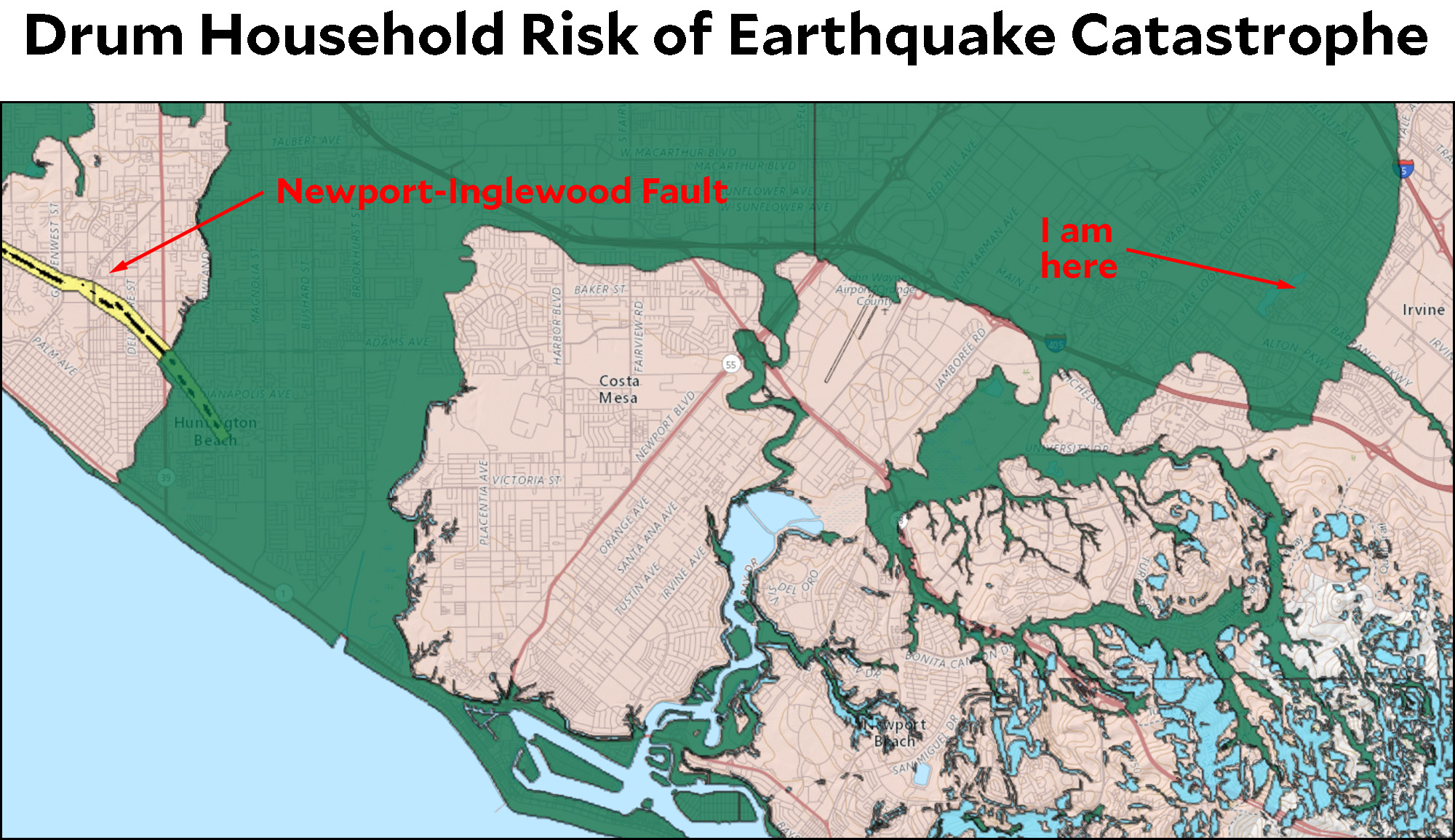
Hey Californians! Our state has finally made it easy to look up your risk of dying in an earthquake with a fun, interactive map. For example, here I am:

The green color indicates that I live in both a fault zone and a liquification zone. This is because most of Irvine rests on a giant foundation of mud, which could be good or bad, depending. But I’m right on the edge of it, and ten miles away from the bitty little Newport-Inglewood fault. So no worries. Unless they decide that the Inglewood-Newport fault is a lot more important than they thought. The LA Times has an explainer about the map here.
BTW, Southern California is not the land of a thousand lakes. The blue areas are landslide zones. Except for the blue areas that are water. Those are a slightly lighter shade of blue. In any case, I’m in no danger of landslides.
As for where you really, really don’t want to be, it turns out the answer isn’t San Francisco. It’s Seattle.


