Whenever I put up a chart in which the vertical axis doesn’t start at zero, I always get complaints that I’m distorting the data. For shame! It happened again this morning, touching off a Twitter conversation that finally demands a response. So here it is. Two quick caveats first:
- This will seem like a long post, but it’s not. It’s short! It just seems long because I’ve illustrated it with lots of charts, and modern technology requires me to display all charts in a very large size.
- The golden rule of all charts is: don’t do anything to deceive the reader. This is something that everyone agrees about. As you’re about to see, however, this sometimes gets fuzzy in practice.
Buckle up, data nerds! This isn’t going to go quite the way you expect, though. Let’s start off with a chart of wages adjusted for inflation:
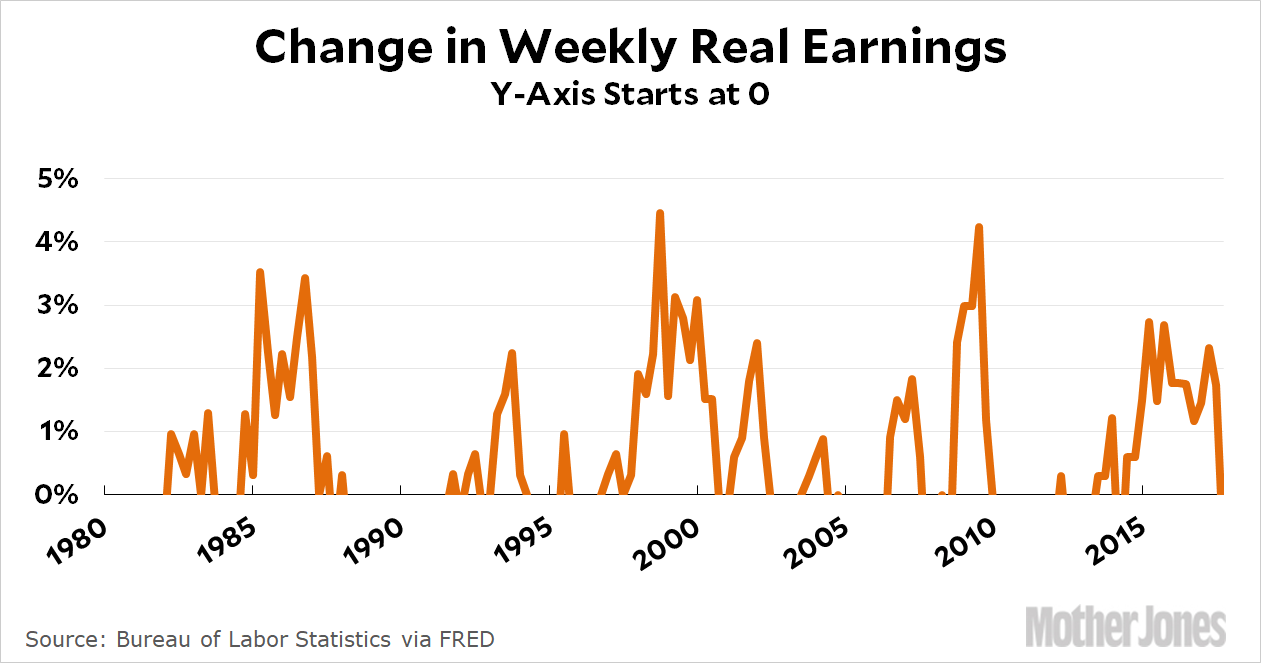
In this chart the y-axis starts at zero, but it doesn’t work because some of the values are negative. Now, before you get excited and claim that I’m cheating because no one is suggesting you should cut off negative values, just hold on. I have a point to make. Obviously this chart doesn’t work. So how about this one?
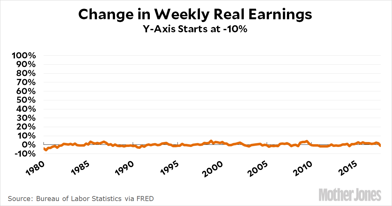
This barely shows anything: the line is just some tiny squiggles. That doesn’t work either. So how about this one instead?
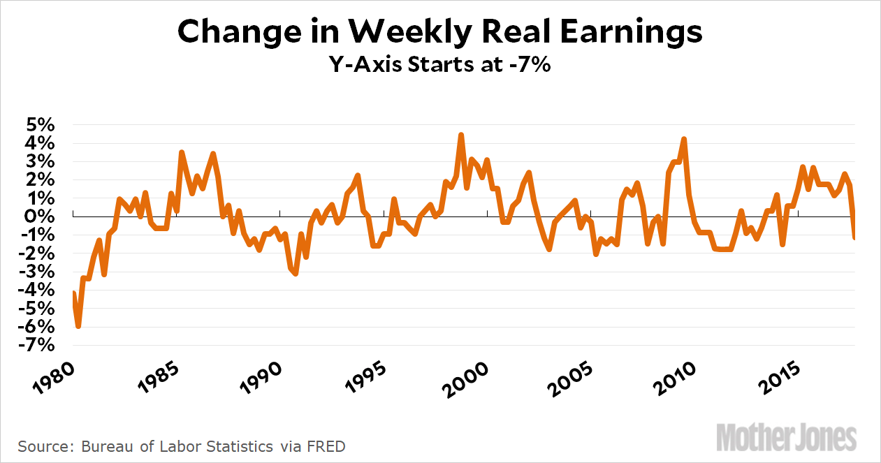
Much better! But think about this: why did I choose a y-axis that goes from -7 to +5? I could have chosen anything, after all. Maybe -10 to +10. Or -20 to +20. Once we’ve decided that zero isn’t the right starting point, we’re in the wilderness.
But we’re not, really. The obvious reason for choosing -7 and +5 is that these are the limits that display all the data without adding a lot of useless white space. In the second chart, it was white space above the line that was a problem. But if useless white space above the line is bad, then useless white space below the line is bad too—and that’s true even if all the data is positive numbers. Here’s a vivid demonstration using global warming as its subject:
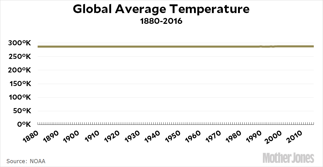
Only an idiot would think this is an effective and truthful display of data. (This idiot, for example.) So we finally have a useful rule: use a scale that (a) shows all the data, but (b) doesn’t incorporate loads of useless white space that compresses the data into incomprehensibility. In the case of the global warming chart, that would mean a y-axis that goes from about 285ºK to 288ºK. It’s the only way to display the data in a way that properly shows the effect it’s trying to show.
But wait! My more sophisticated critics all accept this. They have another complaint: what about bar charts? They should always start at zero, right? Well, how about this one?
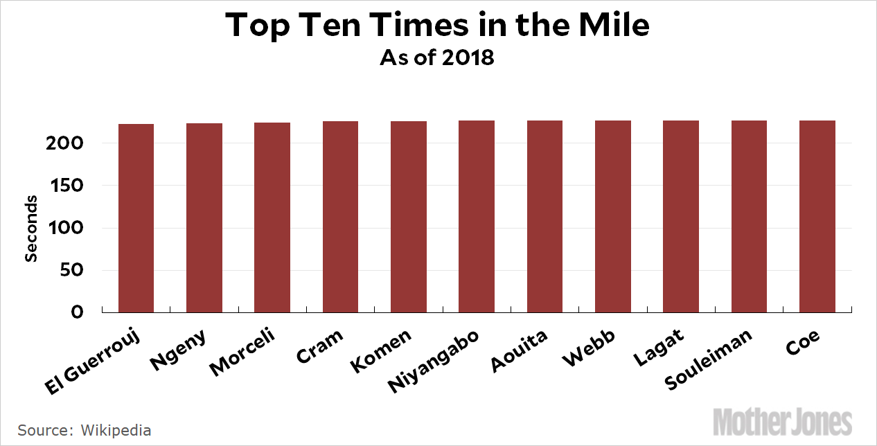
You can’t do this as a line chart because it’s not a time series: it’s a chart showing ten individual people. And yet it’s nearly useless. The top ten milers in the world have times that range from 3:43 to 3:47. But here’s the thing: in the world of mile racers, four seconds is a lot. It’s huge. But if you want to display that, you really have to choose a range of, say, 3:40 to 3:50. Once again, what we’re doing is eliminating useless white space. The only difference is that since it’s a bar chart, the white space is (in this case) red space. See here for another example.
This is basically my case: regardless of what kind of chart you use, your goal should be to display the data in a way that shows the effect you’re trying to show. That means using whatever scale the effect works in. In the case of real wage growth, it’s -7 percent to +5 percent. In the case of global temperatures, it’s 285ºK to 288ºK. In the case of milers, it’s 3:43 to 3:47.
In other words, you can’t always use zero as your starting point. It would be dishonest—and as the chart with negative data was intended to highlight, zero is actually just an arbitrary number anyway, not some kind of natural boundary. The only real question is how best to make it clear to a casual reader that your chart doesn’t start at zero, and I’m not sure what the answer is. Some people like using a little squiggle at the bottom of the y-axis that represents, say, a jump from zero to 285ºK. I’m not a big fan of that because I don’t think most people notice it, but I suppose it does no harm. Mostly, I just think you should very clearly label your y-axis. But this is admittedly not a problem with a great answer.
We’re almost done, but I want to put up two more charts to demonstrate that this can often be more art than science. Here are two charts I put up this morning showing the number of uninsured people since Obamacare was passed:


Which one is better? The top one eliminates dead space and shows the variations better. However, the quarter-to-quarter variations aren’t really that important, and someone skimming the post could easily think that it shows a drop in the uninsured nearly to zero. So maybe the bottom chart is better?
This is where it gets tricky. When the useless white space is 90 percent of the chart, it’s an easy call to get rid of it by moving the y-axis. But how about when the useless white space is only half the chart? Or 60 percent? Or 70 percent? What then?
There’s no easy answer. In this case, I’d probably give the nod to my critics and say that the chart starting at zero is better. You don’t really lose much, and it makes it clear how much further we have to go before we cover all the uninsured who are left. Luckily, the added white space in this particular chart isn’t huge, so we have the option of doing this. But there’s no hard and fast rule here. Your goal should be to display data so that your immediate sense of the scale of change matches the actual scale of change. Sometimes this can actually mean adding a bit of dead space, though I very rarely find a need to do that.
Bottom line: Your aim is to eliminate useless white space so that your data is front and center. The trick, however, is deciding exactly when white space is truly useless. Sometimes that’s easy, sometimes it’s not. But as long as you keep in mind that your primary goal is to never deliberately deceive your reader, you’ll probably be OK most of the time.


