A couple of weeks ago I linked to a study that suggested the anti-overdose drug Nalexone might, on net, actually cause more opioid deaths. I was skeptical because the data seemed to show no real pattern. The authors drew a dashed red line at the point where Nalexone was legalized, and sure enough, it looked like opioid deaths jumped after the new laws were passed. But the line seemed entirely arbitrary.
Now Andrew Gelman has weighed in. He has pretty much the same criticisms I did, but he also has the statistical chops to be taken seriously. However, he also links to Richard Border, who doesn’t say a word but lets the numbers speak for themselves:
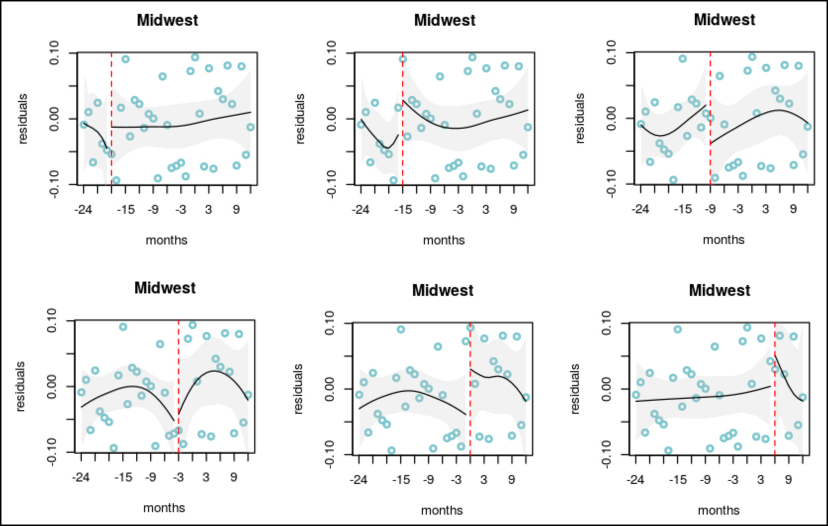
This is a textbook criticism of statistics based on too few data points. As Border shows, you can put the cutoff line anywhere and it looks like there’s a big jump in opioid deaths. But that doesn’t mean anything. The error bars are enormous, and the before-and-after “trends” are meaningless.
I’d add that this also shows the value of simply using common sense. If you remove all the lines and the error bars and simply look at the scatterplot, there’s nothing there. That should make you skeptical from the very start. It’s true that occasionally you can tease real results out of data like this, but you’d better be damn sure of what you’re doing and you’d better check it ten different ways. The authors of this study didn’t do that.


