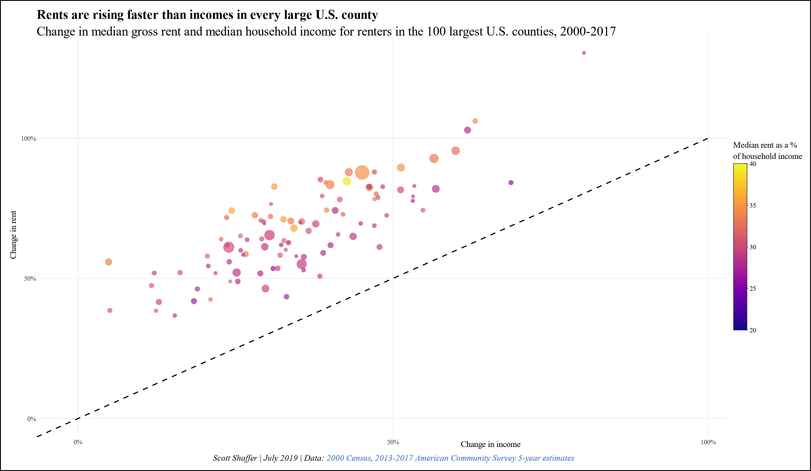
There are lots of ways of looking at the housing market. Via Twitter, Scott Shaffer suggests looking at the change in rent vs. change in income for the largest American communities. Here’s his chart:

Shaffer’s data comes from the ACS. I created a similar chart for a dozen big cities using BLS rent inflation data and Census Bureau income data:

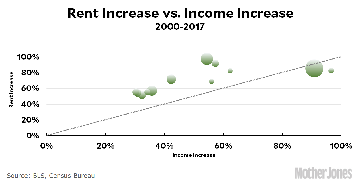
The results are similar, though Shaffer’s chart is more dramatic than mine. The ACS data suggests that, relative to income, rents have increased between 10-30 percent in the largest US counties since 2000. The BLS data comes in closer to 0-20 percent.

My chart is limited because the BLS doesn’t have historical rent series for more than about the dozen biggest cities. It also has the usual drawback of being based on entire metro areas, not just central cities, but Shaffer’s data is county-based and suffers from the same limitation. In any case, the more I’ve worked with this data the less I think this is a problem. In places with tight housing, the surrounding suburbs tend to increase in price at similar rates to the core city.

For what it’s worth, I’ve worked a bit with the ACS data and have come to have some suspicions about it. In Shaffer’s chart, for example, the scatterplot is surprisingly tight even though he’s plotted the top 100 counties. This means it goes all the way from Los Angeles down to cities like Birmingham, Stockton, and Rochester, and it’s hard to believe that every single one of them has seen such similar rent increases.

But then again, maybe they have. That’s part of the problem with this subject: there are lots of different data sources and none of them are ideal. The choice of starting and ending points can also make a big difference. What’s more, income vs. rent in big cities is inherently problematic since it can stay flat just by pushing out everyone with a middle income and attracting lots of new high-income residents. This is very much the case with San Francisco, for example.

Anyway, this is the latest cut at the housing data.

POSTSCRIPT: As usual, I should add that this is all median data and tells us nothing about low-income families or low-income housing. I’ve taken a stab or two at that, but the data is very difficult to get a handle on.

THE FACTS SPEAK FOR THEMSELVES.

At least we hope they will, because that’s our approach to raising the $350,000 in online donations we need right now—during our high-stakes December fundraising push.

It’s the most important month of the year for our fundraising, with upward of 15 percent of our annual online total coming in during the final week—and there’s a lot to say about why Mother Jones’ journalism, and thus hitting that big number, matters tremendously right now.

But you told us fundraising is annoying—with the gimmicks, overwrought tone, manipulative language, and sheer volume of urgent URGENT URGENT!!! content we’re all bombarded with. It sure can be.

So we’re going to try making this as un-annoying as possible. In “Let the Facts Speak for Themselves” we give it our best shot, answering three questions that most any fundraising should try to speak to: Why us, why now, why does it matter?

The upshot? Mother Jones does journalism you don’t find elsewhere: in-depth, time-intensive, ahead-of-the-curve reporting on underreported beats. We operate on razor-thin margins in an unfathomably hard news business, and can’t afford to come up short on these online goals. And given everything, reporting like ours is vital right now.

If you can afford to part with a few bucks, please support the reporting you get from Mother Jones with a much-needed year-end donation. And please do it now, while you’re thinking about it—with fewer people paying attention to the news like you are, we need everyone with us to get there.

payment methods

We Recommend

Latest

Sign up for our free newsletter

Subscribe to the Mother Jones Daily to have our top stories delivered directly to your inbox.

Get our award-winning magazine

Save big on a full year of investigations, ideas, and insights.

Subscribe

Support our journalism

Help Mother Jones' reporters dig deep with a tax-deductible donation.

Donate