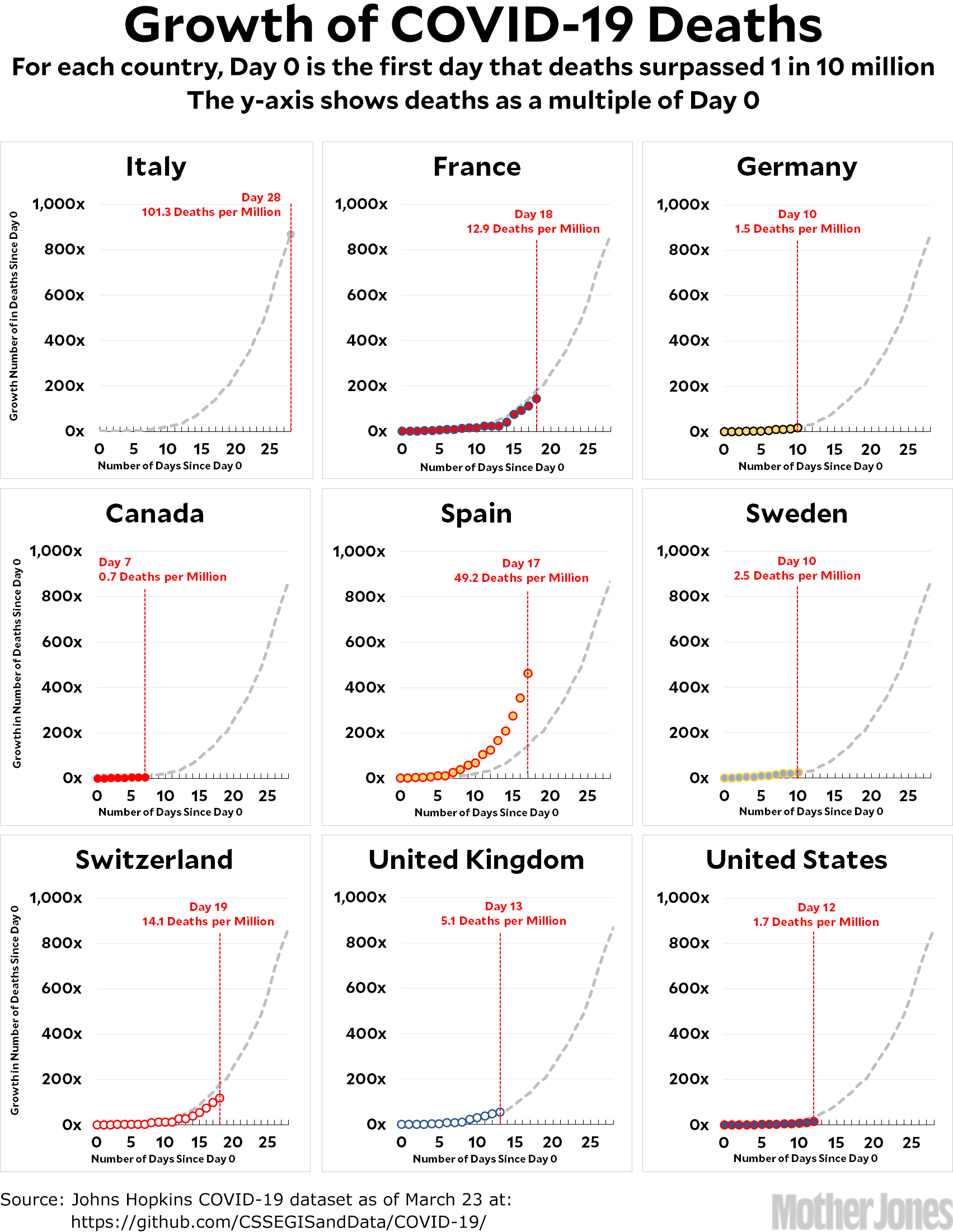
Here’s the coronavirus growth rate through Monday. Most countries are still hewing pretty close to the Italian path, with only the catastrophic growth rate of Spain substantially off the trendline.
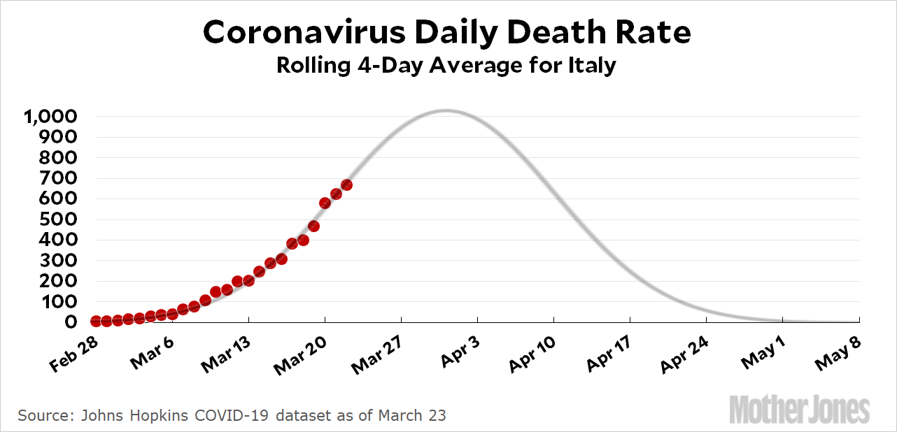
I mentioned yesterday that Italy’s growth rate seemed to be slowing down a bit, and you can see that a little better today, though you still have to squint to see the inflection point around Day 25. However, if you look instead at Italy’s daily death toll (as a rolling average of the previous four days to smooth out the noise), you get this:

The first dot is the average daily death toll from February 24-28. The last dot is the average daily death toll from March 19-23. I overlaid an eyeball fit of a normal curve, which suggests the death rate will peak in early April and the epidemic will end in early May. (There are other ways of charting the data, and they all point to the same thing: an early April peak and an early May finish.) The total number of deaths will be in the ballpark of 25,000, which amounts to 0.04 percent of their total population. If we take control measures seriously and follow the Italian path, the US epidemic will end a little later, in mid-May, and the total number of deaths will be around 100-150,000.
Super important note: This is strictly an amateur guess, and even if it’s accurate it relies on the US putting in place the same stringent control measures as Italy—which we haven’t done yet. And if President Trump succeeds in gutting even the control measures we do have in place, then all bets are off. Beyond that, we have no way of knowing what will happen when the epidemic fades out and we relax the control measures. Will the virus go dormant for the summer months and then return in the fall? Will it re-emerge as soon as the control measures end? Will it continue to be seeded by travel from other countries that are on a different schedule? At the moment there’s both positive and negative evidence about all this, and it’s simply too early to know anything for sure.
Here’s how to read the charts: Let’s use France as an example. For them, Day 0 was March 5, when they surpassed one death per 10 million by recording their sixth death. They are currently at Day 18; total deaths are at 144x their initial level; and they have recorded a total of 12.9 deaths per million so far. As the chart shows, this is slightly below where Italy was on their Day 18.
The raw data from Johns Hopkins has moved. It is now here.


