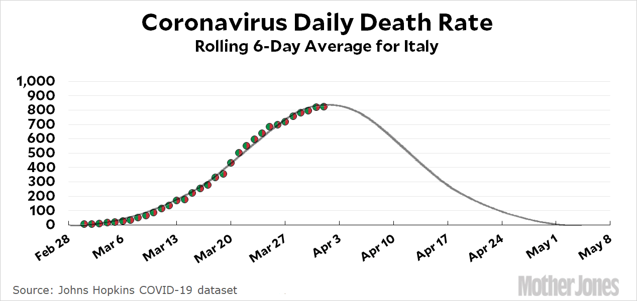
Here’s the coronavirus growth rate through April 1. First, though, some good news:

It looks very much like Italy has just about hit its peak, which means that its daily death rate should start declining soon. And the bad news? The rest of us aren’t close. We still have weeks to go before we peak and start to decline.
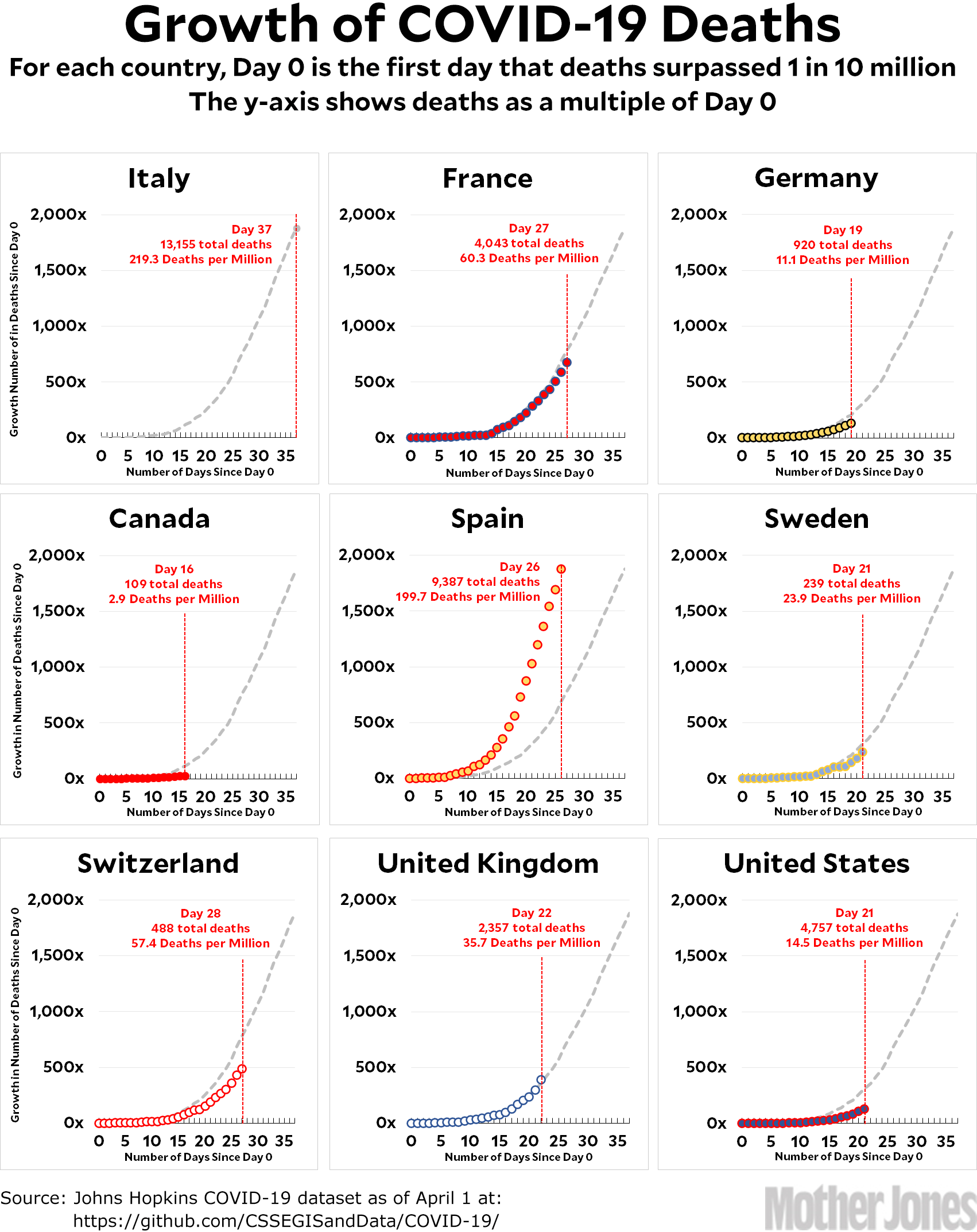
One thing to note: with the exception of Spain and Britain, it’s now looking as if every country is at least slightly below the Italian trendline. It’s hard to know if this means we’ll have fewer deaths than Italy or if we’ve just flattened the curve a bit and spread things out. We’ll have to wait and see.
How to read the charts: Let’s use France as an example. For them, Day 0 was March 5, when they surpassed one death per 10 million by recording their sixth death. They are currently at Day 27; total deaths are at 673x their initial level; and they have recorded a total of 60.3 deaths per million so far. As the chart shows, this is below where Italy was on their Day 27.
The raw data from Johns Hopkins is here.


