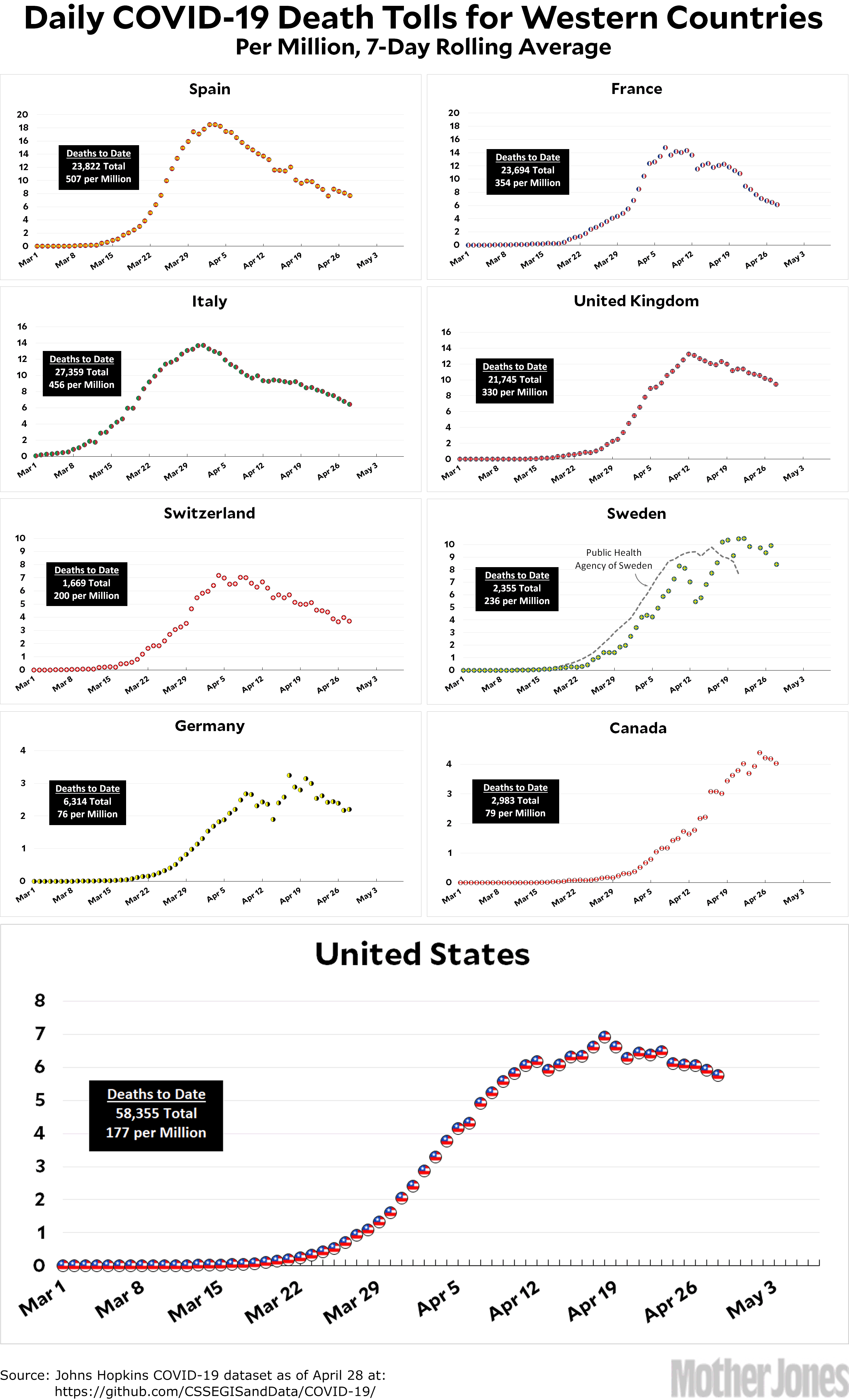
Here’s the coronavirus death toll through April 28. After regaling you a couple of days ago about why I switched to numbers from the COVID Tracking Project for the United States, the Johns Hopkins folks apparently decided to fix up their numbers to be more consistent over time. So the US chart is now pure Johns Hopkins across the board.
At this point, it really does look like every country has reached its peak and is now declining. The big questions are (a) how fast will they decline? and (b) will relaxation of countermeasures cause a resurgence in a few weeks? I’m not sure there’s any good way to predict that. We’ll just have to wait and see.
The raw data from Johns Hopkins is here. The Public Health Agency of Sweden is here.


