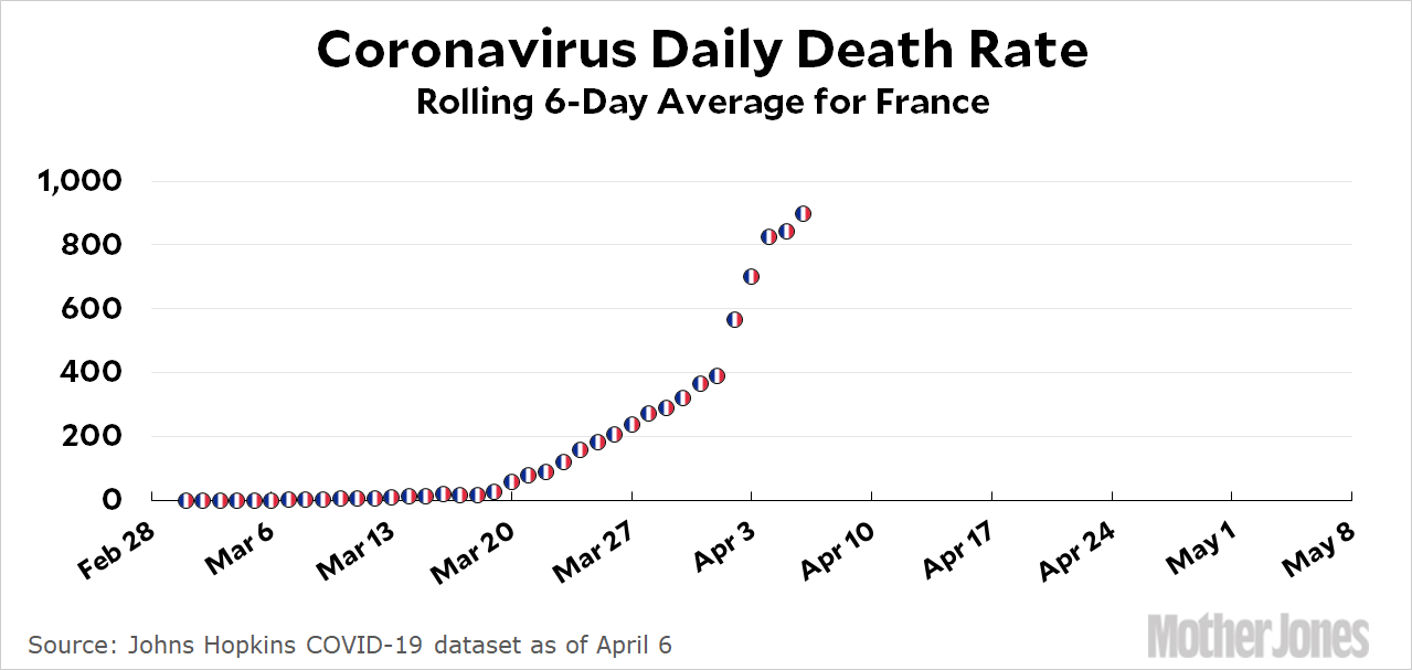
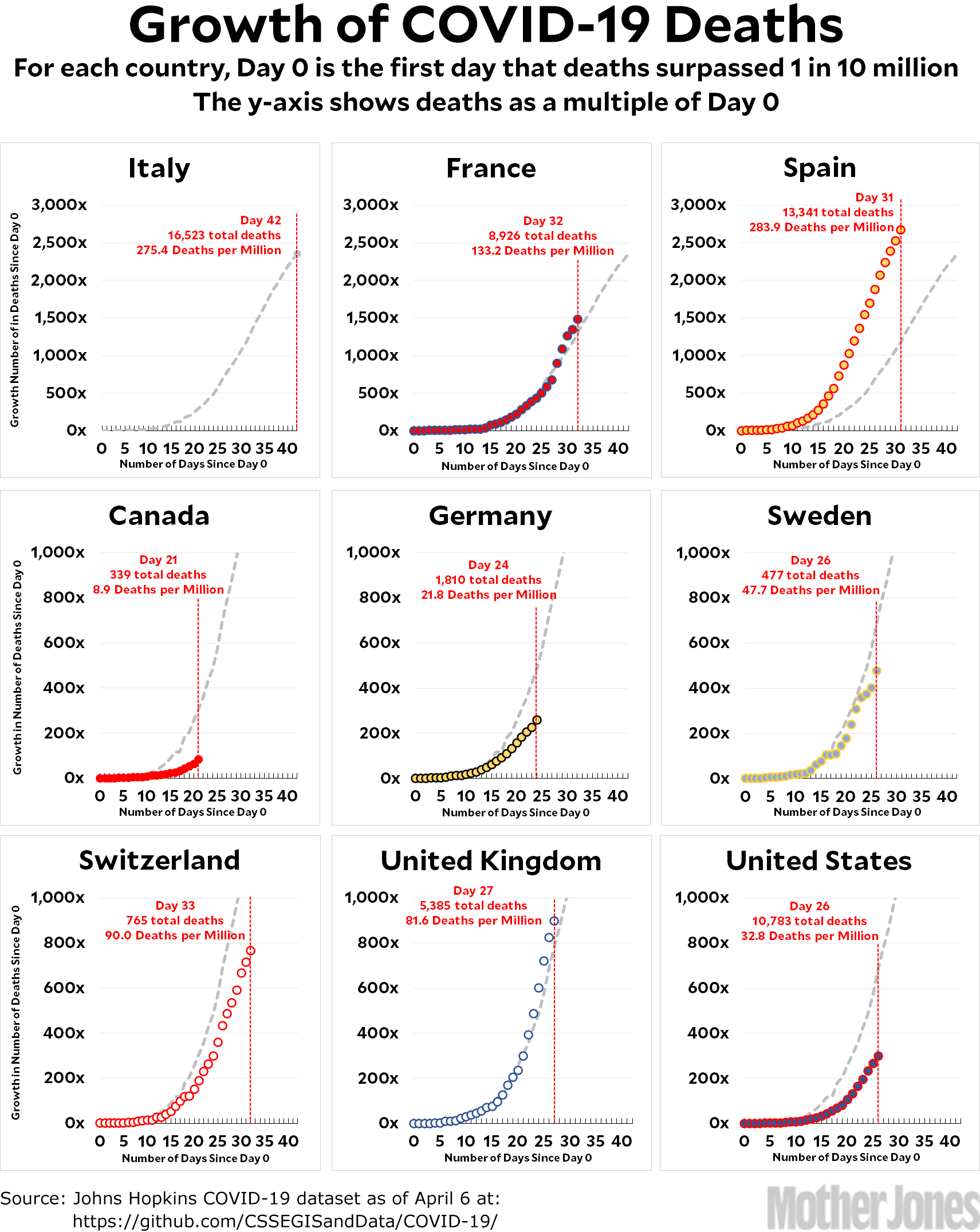
Here’s the coronavirus growth rate through April 6. Italy is solidly past their peak and declining at a good clip. Germany had a bad day and now looks a little farther away from their peak than I thought yesterday. The data from France is so weird that I can’t make sense of it:

There’s an almost perfect linear increase for two weeks, followed by a sudden explosion, with deaths doubling over the course of three days. Unless I did my arithmetic wrong, this looks like some kind of reporting error from the French authorities.
How to read the charts: Let’s use France as an example. For them, Day 0 was March 5, when they surpassed one death per 10 million by recording their sixth death. They are currently at Day 32; total deaths are at 1,488x their initial level; and they have recorded a total of 133.2 deaths per million so far. As the chart shows, this is above where Italy was on their Day 32.
The raw data from Johns Hopkins is here.


