Here’s the coronavirus growth rate through April 7. Italy continues to decline. Germany is still climbing, but showing signs of getting near its peak. The data from France continues to be noisy as hell. Several correspondents tell me this is because France only counted deaths in hospitals for the first couple of weeks, but then started counting deaths in nursing homes too. That’s when the death rate started to zoom upward and got messy.
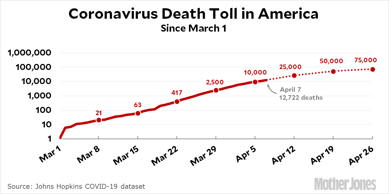
The death toll for the United States continues to show glimmers of flattening:

The growth rate of daily deaths continues to slow down and now suggests a peak sometime in the middle of next week. Total deaths at peak now looks to be around 50-60,000, which suggests a total death toll of around 100-120,000 through June. As usual, this all depends on how well we keep up our countermeasures. Overall, though, things are looking better now than they did a couple of weeks ago.
How to read the charts: Let’s use France as an example. For them, Day 0 was March 5, when they surpassed one death per 10 million by recording their sixth death. They are currently at Day 33; total deaths are at 1,724x their initial level; and they have recorded a total of 154.4 deaths per million so far. As the chart shows, this is above where Italy was on their Day 33.
The raw data from Johns Hopkins is here.


