Reader AV sent me a nice email with a chart of COVID-19 deaths in Sweden. First, though, here’s my chart using Johns Hopkins data:
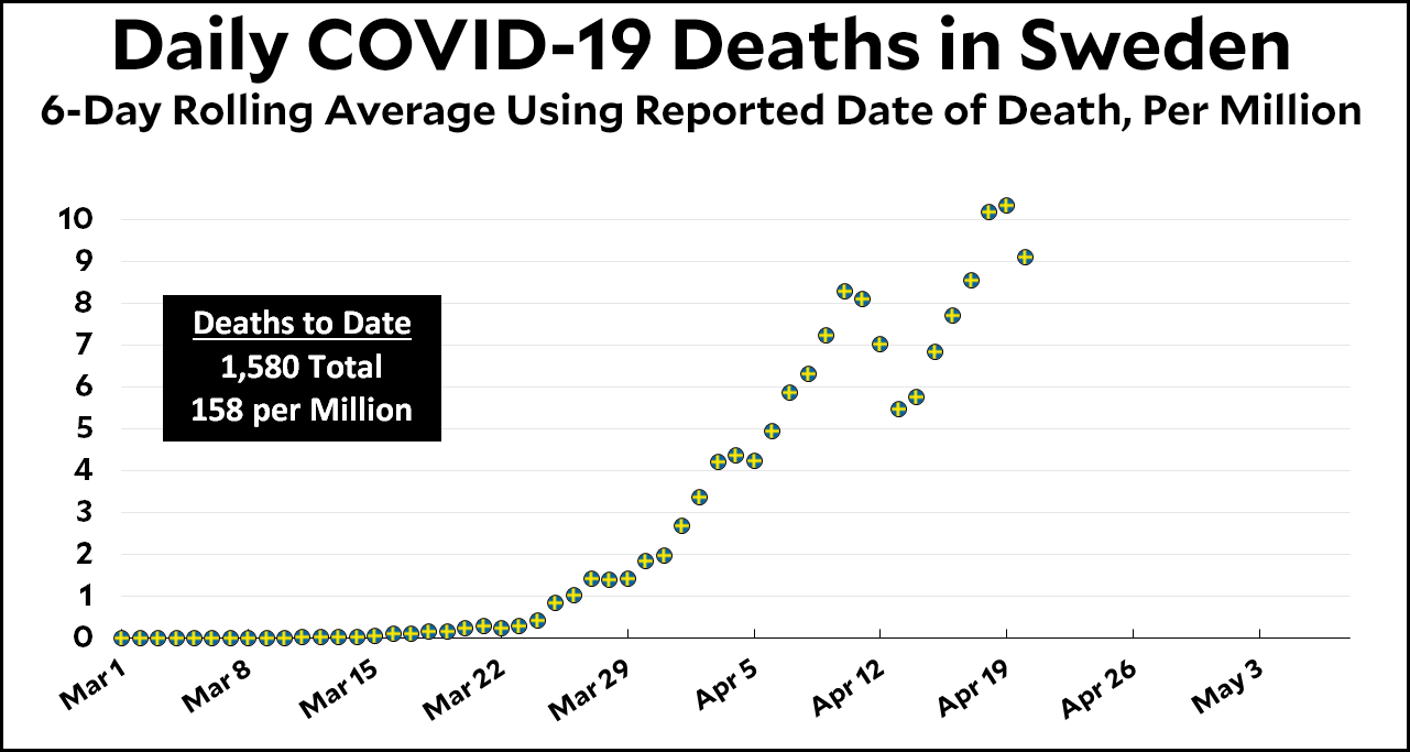
This chart is based on the date that deaths are reported to Johns Hopkins, which means that even using a 6-day rolling average isn’t enough to drown out the big variations in reporting on weekends. Here’s the chart based on data from the Swedish health authorities:
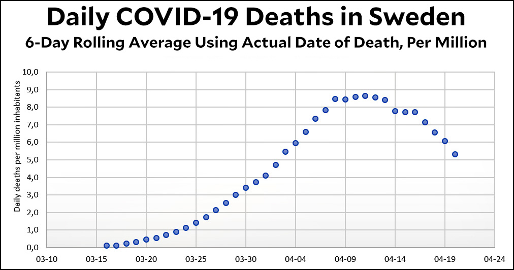
This is the same as mine (6-day rolling average, calculated per million population), but it’s been modified to show the actual date of death. As you can see, it’s much smoother and does indeed suggest that Sweden has peaked and is now declining.
Under normal circumstances I think the reported death date and the actual death date aren’t much different. But Sweden is an exception due to its custom that “weekends are sacred.” That includes reporting COVID-19 deaths, which is why the raw data shows wild swings on weekends and then catches up on Monday and Tuesday.
So will I adopt the Swedish version of COVID-19 deaths in my daily charts? Tune in tomorrow to find out!