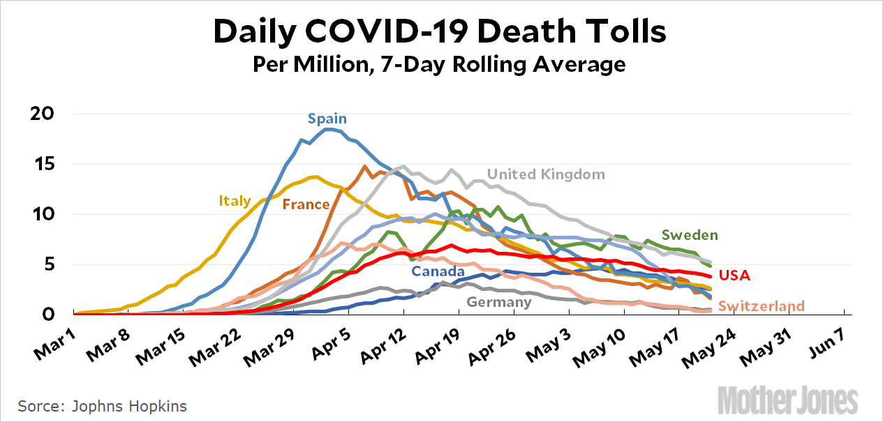
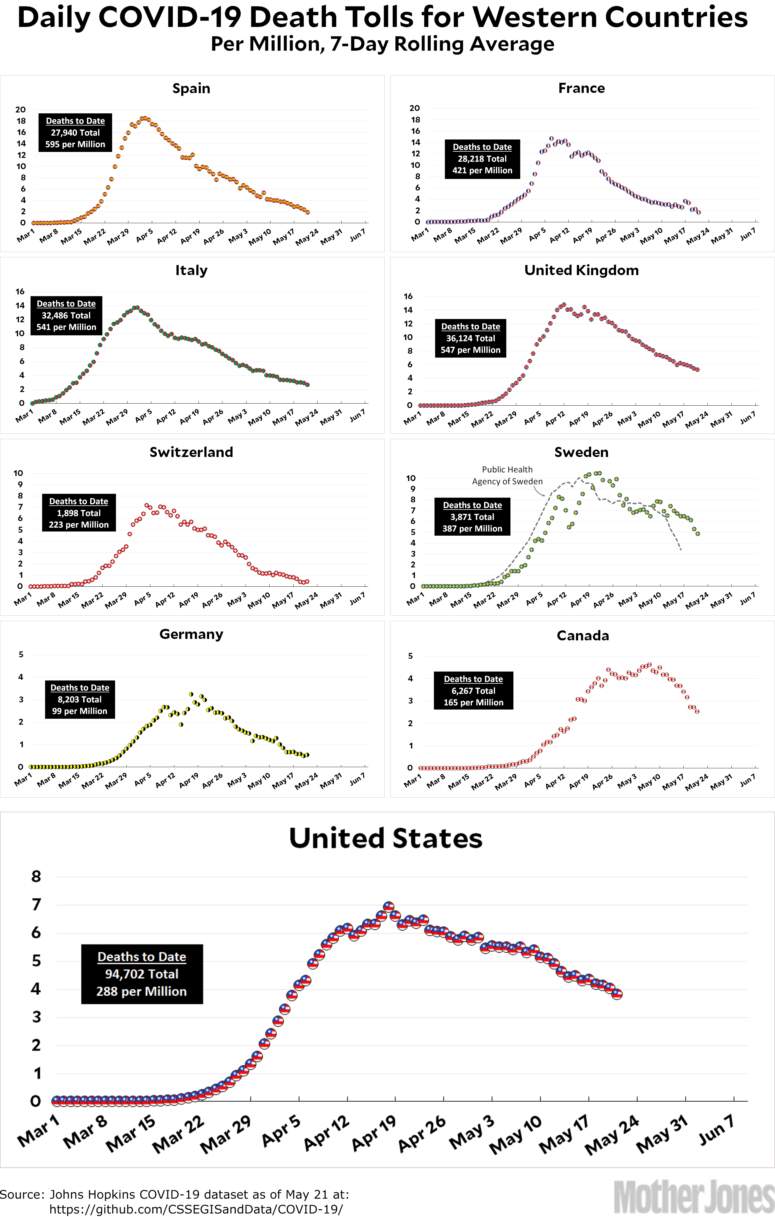
Here’s the coronavirus death toll through May 21. I occasionally get a request to put all nine of the countries I’m tracking on a single chart with a single scale, which would make it easier to compare them. I finally decided to do this, mainly to explain why I don’t do it:

This is a mess. It might be useful now and again, but it’s so hard to decipher that I can’t imagine using it as my standard presentation. I think I’ll stick to separate charts for each country.
The raw data from Johns Hopkins is here. The Public Health Agency of Sweden is here.


