The Wall Street Journal regurgitates concerns about growing debt today, promising 14 charts that tell the story. It’s a weird collection of charts, though, one that seems almost determined not to show debt levels in their simplest form. So here they are. First, corporate debt:
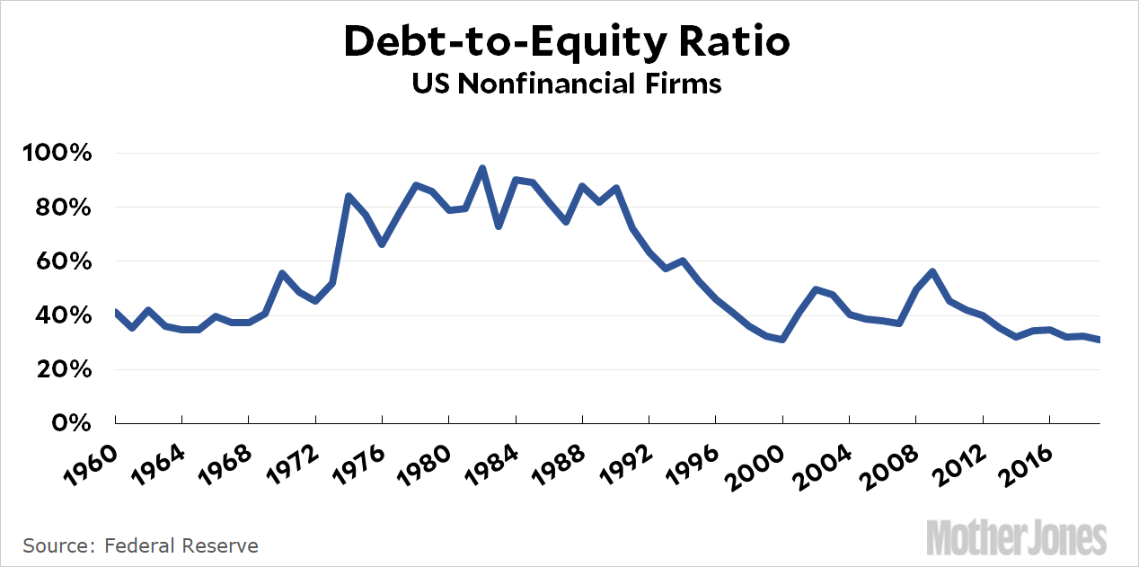
This does not look especially scary. Now here’s household debt:
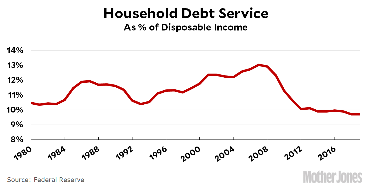
Again, not very scary. In the case of both corporate and household debt, it doesn’t do to just show raw levels or BBB bond issuance or median income. The simplest view is to look at total debt as a percentage of something that accounts for the fact that everything is growing, not just debt. In the case of corporations, debt-to-equity levels are the usual way of gauging things. In the case of households, debt as a percentage of income is the most revealing. Both are at historically low levels.
In the case of corporate debt, you could also look at debt as a percentage of GDP, and that does indeed show steady growth over the past few years—although it’s basically just following the trendline of the past few decades. Still, that might be a modest warning sign.
Overall, though, it’s hard to see debt as a huge problem at the moment. The one exception might be state-level government debt, although that’s declined over the past few years from a post-recession high of 27 percent of GDP back down to a more manageable 17 percent of GDP. That headroom will come in handy, since tax revenues have cratered during the COVID-19 pandemic and Republicans in Congress seemingly have no desire to help out.
Bottom line: There are lots of things to worry about these days, but overall debt levels probably don’t make the top ten. What does make the top ten, as usual, is assistance aimed specifically at people whose incomes have been hit the hardest by COVID-19. We should worry a lot more about that and a lot less about economy-wide debt levels.


