Here’s a headline in Politico:
Unemployment Is Much Worse Than You Think — Here’s Why.
Anyone who wants full-time work but can only find part-time work, and those working full-time but earning too little to climb above the poverty line, should be considered functionally unemployed. I’ve begun to calculate this, which I’ve dubbed the True Rate of Unemployment. And the TRU in December wasn’t 6.7 percent — it was an alarming 25.1 percent.
This is folly. There are dozens of ways of calculating underemployment, and all of them have their uses depending on what you want to know. They’re all “true” as long as you aren’t making up the underlying data.
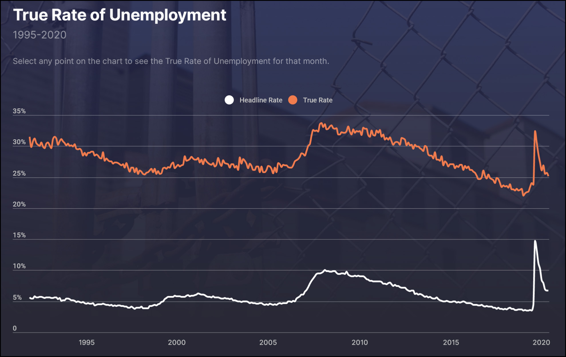
But that’s not why I’m writing about this. The author doesn’t include a chart showing how TRU has changed, and it turns out that’s a good thing for his thesis. Naturally, though, I clicked the link:

According to this chart, the evil headline rate shows that unemployment is about a point higher than it was in 1995. That seems reasonable. However, the TRU rate is five points lower than in 1995. Far from showing that unemployment is “much worse” than we think, it shows that unemployment has steadily declined. And unlike the headline rate, which shows the COVID-19 spike peaking at half again higher than the peak of the Great Recession, the TRU rate shows it spiking at a point lower than the peak of the Great Recession. In other words, unemployment is better than we think!
Bottom line: Pay no attention to this kind of stuff. You can prove anything you want by creating your own custom index of employment metrics. There’s nothing wrong with it if it helps to illustrate something interesting, but by no means do any of these things show that unemployment is “better” or “worse” than we think it is.


