Here’s a great series of cartograms—maps distorted to reveal a bias. In this case media attention by region. You can click on the buttons to see how newspapers warp their coverage of world news according to parochial interests. Nicolas Kayser-Bril first published this online on L’Observatoire des Médias, and later in expanded form in the Online Journalism Blog. Below is a newer cartogram, made in partnership with Gilles Bruno, of the coverage of the blogosphere. Their hope is to update these maps daily or weekly to pressure editors into covering more diverse issues.
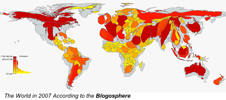
As for the cartographers’ bias, where are the data for coverage of the world-ocean, accounting for more than 70% of Earth’s surface? Where’s Antarctica?
Julia Whitty is Mother Jones’ environmental correspondent, lecturer, and 2008 winner of the Kiriyama Prize and the John Burroughs Medal Award. You can read from her new book, The Fragile Edge, and other writings, here.


