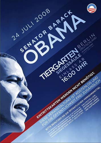
 Jeez, I know I’ve already blubbered endlessly over the sophistication of Obama’s graphic design, but you just gotta see this. It’s a poster being used to advertise the senator’s upcoming speech in Berlin, and it may be the finest piece of contemporary mainstream political art I’ve ever seen. All text is set at a 45-degree angle on varying shades of Obama Blue, with one thin swath of brick red emphasizing that “Tickets are not needed.” Barack’s profile is oddly de-emphasized, yet the whole poster seems to be covered in a subtle gradient, creating a definite glow from that side of the page. Some rabble-rousers think that any poster with a profile is Hitler-esque, but the blog Meaningful Distraction more accurately sees the poster as a tribute to classic German modernism, specifically the Bauhaus movement, which, like constructivism, revolutionized graphic design by setting type on diagonals, around corners, and even spirals. Of course, it fits right in with my theory about Obama’s design being an example of his post-modern campaign, as much about the references as anything else, but whatever, it looks really cool. See a larger version after the jump.
