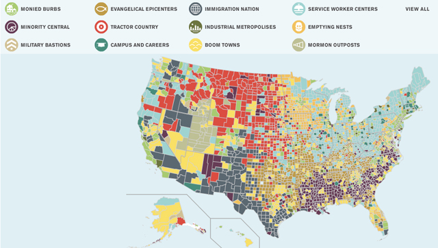
 Image Courtesy of the AtlanticBy now, you’ve probably taken a look at our (As Seen on TV!) charts on the rising income equality gap in the United States. Now the Atlantic has gotten in on the action, with this interactive map from Patchwork Nation’s Daniel Chinni and James Gimpel. Look at all the pretty colors.
It’s a pretty fantastic concept, conveying the complexity of the American landscape in a way that the red state-blue state map—or even a map about where you can marry your cousin—simply can’t. But I’ve got some issues.
For one thing, it’s subject to the same fundamental flaw of the electoral map: There’s only room for one category per county. Colorado Springs has been called the “Evangelical Vatican,” but it’s not an “Evangelical Epicenter” on Chinni’s map, because it’s also a “Military Bastion.” The two categories are of course related, but there’s no room for that kind of complexity. Orange County, likewise, gave us modern the modern conservative movement and Billy Graham, but it’s a “Monied Suburb” here, which puts it in the same category as certain parts of Vermont. Hispanic immigration extends far beyond the Southwest, but because it’s not a defining force like it is in, say, Imperial County, the demographic shift barely registers.
A more systematic problem is simply that it’s really, really tough to come up with any sort of grouping system for American places. States don’t work. Congressional districts don’t either. Counties have the benefit of at least being relatively small, but that’s still highly variable—and in any event totally blind to population. Cook County, Illinois has 5 million residents and encompasses about half of the Patchwork categories; Brewster County, Texas has 10,000 people but takes up four times as much space. Alaska looks like one giant boomtown but in reality no one’s building McMansions at Denali National Park.
This isn’t a problem with Chinni and Gimpel—who’ve done great work here—so much as it’s a problem with making maps about America.


