MAP: 2012 Was the Hottest Year on Record in the US

Get your news from a source that’s not owned and controlled by oligarchs. Sign up for the free Mother Jones Daily.


Just saying.

This NOAA map shows a sampling of places where weather records were broken last year. You probably guessed that red indicates heat. Yellow represents dryness; orange is a double whammy record for heat and dryness.
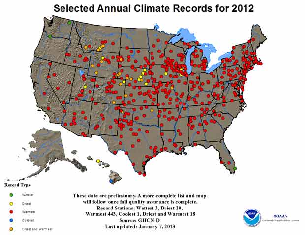
Image courtesy of NOAA


Keep us relentless, independent, and free to read.

For 50 years, Mother Jones has offered honest, investigative reporting you can rely on:

    • Relentless in the pursuit of truth, unafraid to hold the powerful to account

    • Independent from influence or agenda from oligarchs and corporations

    • Freely accessible to every reader, never behind a paywall

But we can’t do any of this without you. Reader support powers our newsroom to stay nimble and fearless, ready for whatever story comes next. If you can, make a donation today.

Keep us relentless, independent, and free to read.

For 50 years, Mother Jones has offered honest, investigative reporting you can rely on:

    • Relentless in the pursuit of truth, unafraid to hold the powerful to account

    • Independent from influence or agenda from oligarchs and corporations

    • Freely accessible to every reader, never behind a paywall

But we can’t do any of this without you. Reader support powers our newsroom to stay nimble and fearless, ready for whatever story comes next. If you can, make a donation today.

We Recommend

Latest

Sign up for our free newsletter

Subscribe to the Mother Jones Daily to have our top stories delivered directly to your inbox.

Get our award-winning magazine

Save big on a full year of investigations, ideas, and insights.

Subscribe

INDEPENDENT. BECAUSE OF YOU.

Mother Jones has no billionaires calling the shots—just readers like you making fearless reporting possible

Donate