Fight disinformation: Sign up for the free Mother Jones Daily newsletter and follow the news that matters.
Via Andrew Sullivan, here’s a Forbes interactive map showing both the inward and outward migration from my home county:
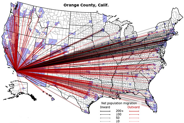
What’s interesting is that the outward migration is all over the map, but the inward migration is almost exclusively from the East Coast and bits of the upper Midwest. I’m not sure why. In any case, click the link if you want to see the migration pattern for whatever county you live in.