Fight disinformation: Sign up for the free Mother Jones Daily newsletter and follow the news that matters.
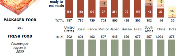
Via Ezra Klein, here’s a fascinating little New York Times graphic that shows how much food we eat compared to other countries. Though, actually, it’s not so little, which is why I’m just excerpting a snippet here. Frankly, I’m a little surprised that our consumption of packaged food isn’t higher than it is. It turns out that it’s not really that different from France or Spain.
But when you drill down into the details things look a lot different. We eat a lot of meat, for example, while Spaniards eat vast amounts of fruit. On the packaged side, we eat lots of microwave meals (as do the Japanese), while the French and Spaniards eat a lot of baked goods. And we’re way ahead of everyone in our consumption of snacks and candy. USA! USA!