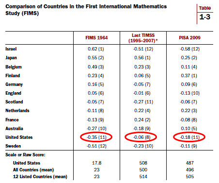
Via Jay Mathews via Bob Somerby, today’s chart of the day1 demonstrates vividly the long, slow decline of American education. Except wait. It doesn’t show that at all. These figures come from Brookings Institution scholar Tom Loveless, and they show how American kids have done on international math tests compared to kids from eleven other advanced countries. First, here’s the raw data:

The circled numbers show how American students compared to the average of the entire dozen countries. In 1964, we were 0.35 standard deviations below the mean. In the most recent tests, we were only 0.06 and 0.18 standard deviations below the mean. In other words, our performance had improved. Here’s Loveless on the notion that we once led the world in education and have since collapsed:
This is a myth. The United States never led the world. It was never number one and has never been close to number one on international math tests. Or on science tests, for that matter….[And] there has been no sharp decline—in either the short or long run. The United States performance on PISA has been flat to slightly up since the test’s inception, and it has improved on Trends in Mathematics and Science Study (TIMSS) since 1995.
Now, we’re still below average among these dozen countries, so this is hardly a glorious result. But we aren’t doing any worse than we did in the supposed glory days of the 50s and 60s. We’re doing better. And as Mathews says, “If we have managed to be the world’s most powerful country, politically, economically and militarily, for the last 47 years despite our less than impressive math and science scores, maybe that flaw is not as important as film documentaries and political party platforms claim. And if, after so many decades of being shown up by much of the rest of the developed world, we are improving, it might be time to be more supportive of what we already doing to fix our schools.”
Maybe so. One thing that’s pretty clear, though, is that America does a terrible job of educating low-income students. But even there, the comparative data is unclear (or at least, I’ve never seen clear data). Do our low-income kids score worse than other countries’ low-income kids? Or do we simply have more low-income kids? Since income figures aren’t routinely gathered for these tests, and international comparisons of income are problematic anyway, this isn’t an easy question to answer.
I’m supportive of experimenting with education reforms. We’ll never know for sure if there are better ways of educating our children unless we try lots of things and see what works. Still, the one metric that’s always crystal clear, no matter who’s doing the measuring, is that school performance plummets when the concentration of low-income kids gets above 50% or so. This suggests — though it doesn’t prove — that the real problem is poverty, not terrible schools. Unfortunately, that’s an even harder problem to solve than schools by themselves.
1Yes, yes, it’s a table, not a chart. So sue me.


