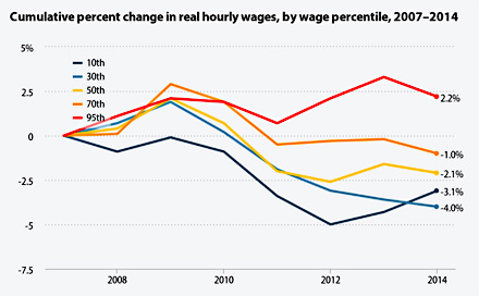
EPI’s Elise Gould provides us with wage data for 2014 today, and the results aren’t pretty:
- Every group has seen a cumulative drop in wages since 2007 except for the top 5 percent (red line).
- Every group saw a drop in
 wages in 2014 except for the bottom 10 percent (dark blue line).
Why did wages of the poor rebound a bit last year? Because 19 states raised their minimum wages:
A state-by-state comparison of trends in the 10th percentile suggests that these minimum-wage increases account for the nationwide 10th percentile increase. Between 2013 and 2014, the 10th percentile wage in states with minimum-wage increases grew by an average of 1.6 percent, while it barely rose (a 0.3 percent increase) in states without a minimum-wage increase.
In other news about wage growth, women have done slightly better than men; whites have done better than blacks; and college graduates have done better than high school grads. The full report is here.


