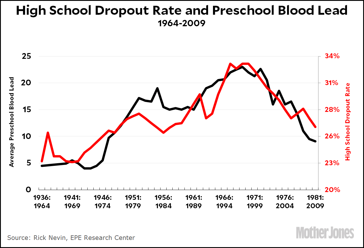
In a meandering post yesterday that ended up on the subject of lead and crime, I posted some charts showing the correlation of childhood lead levels with crime, teen pregnancy, and high school dropout rates. Here’s the dropout chart:

This correlation should come as no surprise. The connection between lead and crime may still be debatable, but the connection of lead with IQ and learning deficiencies is rock solid. There’s literally no one who doesn’t accept the research on this. So it makes sense that as lead poisoning in children increases, the dropout rate of these children a couple of decades later would increase too.
But if you look at this chart closely, you’ll see something funny: the best fit suggests a lag time of 28 years. That’s not right. The lag time ought to be 16 or 17 years, or at least something in that ballpark. What’s going on?
One possibility, of course, is that this is just a chance correlation. Something else caused the rise and fall of the dropout rate and lead had only a little to do with it. Without further study, there’s no way to know for sure. Alternatively, this could be a statistical artifact. Dropout rates are tricky to measure, and not everyone agrees on how to do it. Does a GED count as “graduation,” for example?
In other words, there could be a bunch of things wrong here. But let’s suppose this correlation is real. If so, what would account for the 28-year lag?
The best guess I can come up with is that dropout rates depend about equally on both parents and kids. The rate increases if the kids are duller or if the parents are duller. So if the lag time for the the children themselves is, say, 16 years, and the lag time for the parents is 40-years, the best fit for the final curve is a 28-year lag.
I have no idea if this holds water, and I’m not even slightly invested in it. I’m mostly curious about whether this correlation is meaningful, and if it is, whether there’s some reasonable explanation for the odd lag time. If you have any guesses, toss ’em out in comments.


