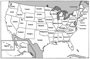
Cribbing from a Danish (?) blogger, The Big Picture provides us with a neat little map in which each American state’s economic output is analogized to a country’s GDP. The map is below and if you click on it, it will take you to a larger version.
The U.K., Japan, Germany, China, Italy and India are all omitted because they have economies larger than that of the most productive American state, California. For a discussion of how the comparisons here are slightly inaccurate, see the comments section of The Big Picture.


